Remote Sensing: An Examination of Research Reports in Economic and Environmental Geology
Earth Science Extras
by Russ Colson
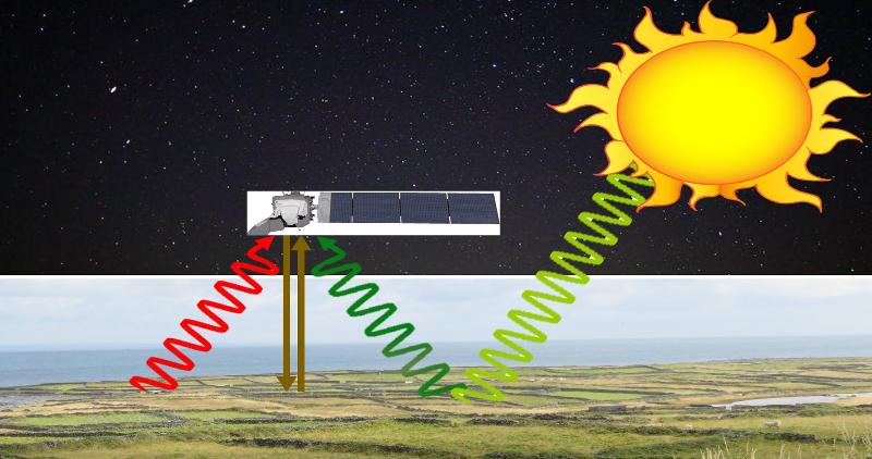
Remote sensing requires that there be something coming from the earth to sense! That might be radiation that this reflected from the ground (or reflected after some interaction that affects the wavelengths), it might be radiation directly emitted from the ground, or it might be radiation beamed from the remote sensing device and bounced back from a surface, all of which are illustrated in the image above.
The example study below comes from "Mapping Critical Minerals from the Sky," by Anjana K. Shah, Robert H. Morrow IV, Michael D. Pace, M. Scott Harris, and William R. Doar III, GSA Today, Vol 31, No. 11, Nov 2021, pp. 4-10.
Here is a selection of text from the article, including some of the introductory material that gives the purpose and context of the study and also a description of the remote-sensing methodology. Read it carefully so as to understand, and then ansewr the following questions about what the reading implies. If there are words or concepts that you don't understand (placer deposits, aeroradiometric, scintillation, etc) feel free to look them up (!), although you can probably figure out their meaning from context.
Critical mineral resources titanium, zirconium, and rare earth elements occur in placer deposits over vast parts of the U.S. Atlantic Coastal Plain. …. As part of a national effort to collect data over regions prospective for critical minerals, the first public high-resolution aeroradiometric survey over the U.S. Atlantic Coastal Plain was conducted over Quaternary sediments in South Carolina. The new data provide an unprecedented view of potential deposits by imaging Th-bearing minerals in the heavy mineral assemblage.
Several <previous> studies have shown that radiometric methods can directly image shallow Ti-Zr-REE–heavy mineral sand concentrations due to the natural radioactivity of monazite, an REE-phosphate mineral containing small amounts of Th and U (Mahdavi, 1964; Robson and Sampath, 1977). Early airborne surveys used scintillation to measure the total gamma ray count (Force et al., 1982; Grosz, 1983; Mudge and Teakle, 2003). In subsequent years, airborne gamma spectrometry methods were developed, allowing the distinction of signals due to K, Th, and U (International Atomic Energy Agency, 2003; Duval et al., 2005). In most of the United States, gamma spectrometry surveys are currently limited by coarse line spacing (1.6–10 km) but do show broad regions in the southeastern U.S. where Ti-Zr-REE deposits are prospective (Grosz et al., 1989; Shah et al., 2017).
The 2019 South Carolina survey, flown with modern equipment and 400-m flight line spacing, represents the first high-resolution public aeroradiometric survey over U.S. Atlantic Coastal Plain sediments. Coverage over 12,000 km2 with a footprint of 100–200 m provides data at a scale not feasible through drilling campaigns.
The 2019 airborne magnetic and radiometric data were collected over a 134 km × 90 km area surrounding the city of Charleston, South Carolina, by contract for the U.S. Geological Survey. This method provides statistical estimates of K, Th, and U concentrations within the upper 1 m of the surface and several hundred meters in each horizontal direction (International Atomic Energy Agency, 2003). Th and U involve multiple decay series, so measurements are typically referred to as equivalent uranium (eU) and thorium (eTh). The surveys were flown along NW-SE traverses at a nominal height of 100 m above ground, although areas above the city of Charleston were flown at >300 m above ground as per safety regulations. Data and details regarding contractor processing are provided by Shah (2020).
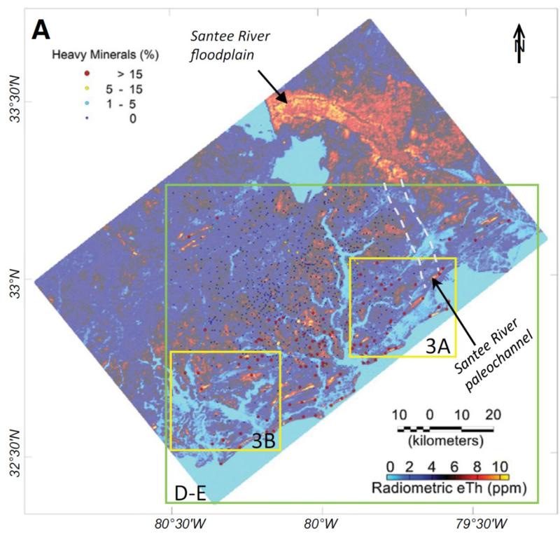
When interpreting a landscape based on remote sensing, it's important to confirm that your measurements made remotely do actually reflect the 'truth' on the ground. This is called 'ground truthing.' An example ground truthing step for this study is shown in the map below. In this map, ground measurements (measurements of the proportions of heavy minerals in shallow core samples taken by researchers on the ground) are shown by colored dots (the key to the dots is in the upper left of the map). These ground measurements can be compared to the remote sensing data which is shown by color overlays (with the key to eTh concentrations being in the lower right of the map). The Atlantic Ocean is in the lower right of the map. eTh stands for "equivalent thorium" and is based on the detection of gamma rays resulting from several different radioactive decay processes for thorium).
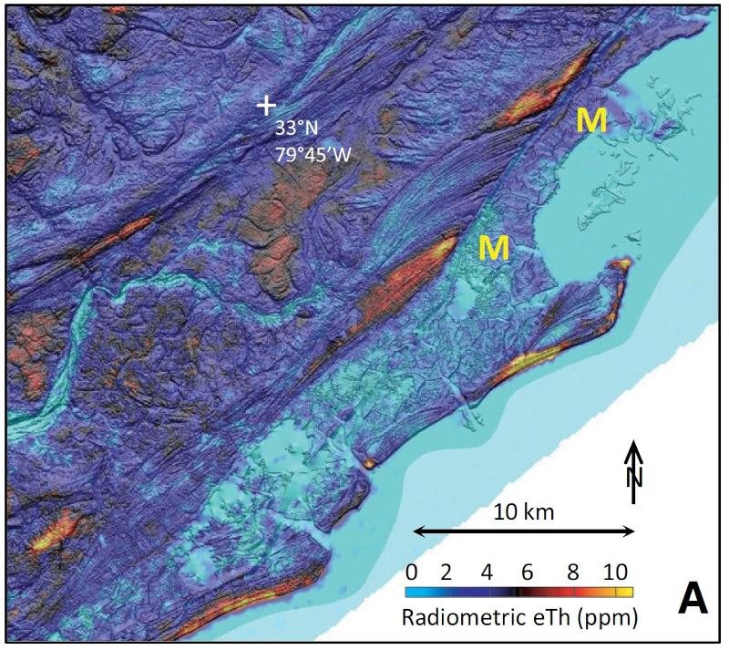
One of the "superpowers" of geographical information systems (GIS) is the ability to easily combine different spatially-correlated variables into a single map or statistical analysis. The map below shows a close up of the eTh data combined with a shaded relief of the topography based on lidar measurements (lidar stands for LIght Detection And Ranging and is a method that bounces lasers off the surface in order to determine e.g. elevation). Combining these two spatially-correlated variables allows for more sophisticated analysis than would thinking of either of the two by themselves.
The exercises below are based on the paper: "Mapping of heavy metal pollution in stream sediments using combined geochemistry, field spectroscopy, and hyperspectral remote sensing: A case study of the Rodalquilar mining area, SE Spain" by Eunyoung Choe, Freek van der Meer, Frank van Ruitenbeek, Harald van der Werff, Boudewijn de Smeth, and Kyoung-Woong Kim, in Remote Sensing of Environment vol 112 (2008), pp 3222–3233.
As mentioned in the previous set of problems, remote sensing is not some kind of magical 'detection' of things at a distance, like the detection of 'life signs' in the Star Trek universe movies and TV shows. In Star Trek, life signs are detected at a great distance,including through space or through rock, such that living people can clearly be disitnguished from dead ones, even to the point of recognizing the moment of death. What could possibly be detected to convey this information? The sound of a heartbeat (it could not be transmitted through the vacuum of space)? Electromagnetic activity in the brain (difficult enough to detect in extremely close proximity when not going through rock)? Perhaps some as yet unidentified 'magical' emination of the soul?
In the real world, remote detection requires that there be a detectable signal that is sufficiently powerful to be detected at a distance with whatever detection device we are using. Usually, to start with, we don't know what signal to look for in order to detect any particular substance or property. Fictional devices where you can simply dial in "look for arsenic" and it goes out to look for arsenic is, well, fiction. In the real world, nailing down the signal that tells us about some property of a landscape (arsenic concentration for example) takes research into the nature of the material (arsenic), how that material typically manifests itself in the landscape, and what signal that material might give off that could be detected. Then a ground-truthing needs to be done to demonstrate that in fact the material and its concentration can be effectively measured remotely.
The study we are looking at as our example is primarly aimed at testing one idea for detecting elevated concentrations of Lead (Pb), Arsenic (As), and Zinc (Zn) in a landscape down stream from a mining district. We are going to walk through a few of their tests.
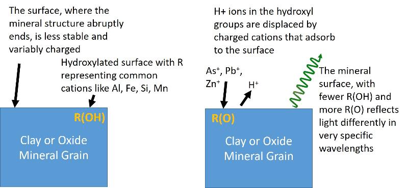
This particular study begins with the premise that the way that pollutants of interest (Pb, Zn, and As) occur in the downflow environments is as adsorbed ions on clay and oxide minerals. Adsorption refers to the way that some ions can 'stick to' the outside of minerals or other materials. A simplied illustration of this idea is shown below (H = hydrogen, O = oxygen, R = major cation in the mineral structure such as Aluminum, Silicon, Iron, or Manganese), OH = hydroxyl group, hydroxylated = having lots of hydroxyl groups, Pb = lead, As = arsenic, Zn = zinc.) Study the model below to understand what it is telling you (A model is a mental contruction of what is going on, not an experimental meaurement, and is therefore more like an explanation of the natural world than evidence for it.)
The researchers studied the relationship between the concentration of heavy metal pollutants that they measured in sampled soils and the reflectance spectra of those samples which they also measured. They measured these reflectance spectra with ground-based techniques on very small samples 10 mm wide (thus, this is not remotely-sensed data).
Wavelength (of reflected light) is plotted on the the X-axis and the amount of light that is reflected off of the samples is on the Y axis. Wavelenghts are reported in nanometers and are in the range of visible light for graph B, near-infrared for C, and span some of both for graph a. These areas of the spectrum are places where the hydroxyls in the clay and oxide minerals are expected to have an effect. For graphs b and c, the spectra are 'normalized' to take out known variations in the spectra due to other causes so as to focus specifically on changes caused by changes in hydroxyls to these areas of interest. Concentrations in parts per million (ppm) in the legend for the chart are total heavy metals (Pb, As, etc).
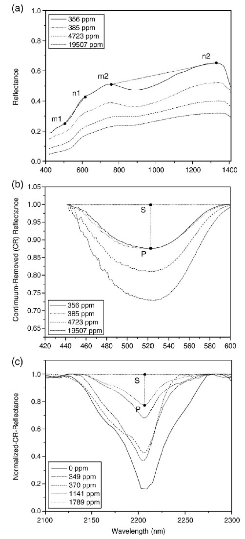
Whereas graphs b and c show changes in reflectivity at particular wavelengths as a function of heavy metal concentration, graph a shows how the ratio of reflectivity at different wavelengths changes as a function of heavy metal concentrations. For example, take note of the ratios n1/m1 and n2/m2. Do you think these are changing with heavy metal concentration?
There are other values that can be derived from the measured spectra, including the area under the 2200 reflectance curves (the area will be related to how much reflectance there is, but includes information from the entire curve, not just its value at one specific wavelength, which gives us more information and therefore more consistent results), and the assymmetry of the 2200 reflectance curves (notice how the shape of the curves change, not just their height).
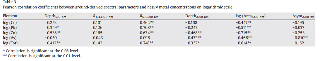
The table below shows information about the correlation of the various measurements to the concentrations of specific contaminants. Higher correlation coefficients correspond to more of the variation in the concentrations being 'predicted' by the spectra. The chart also shows statistical significance of the correlations--lower numbers correspond to "less chance of a random correlation that isn't real' and thus greater confidence in the correlation. Often in science, if a correlation is not 'true' at least at the 95% confidence interval (or 0.05 in the table below) we don't really consider it likely enough to 'conclude as true'. The 0.01 value (99% chance the correlation is not due to chance) is even better.
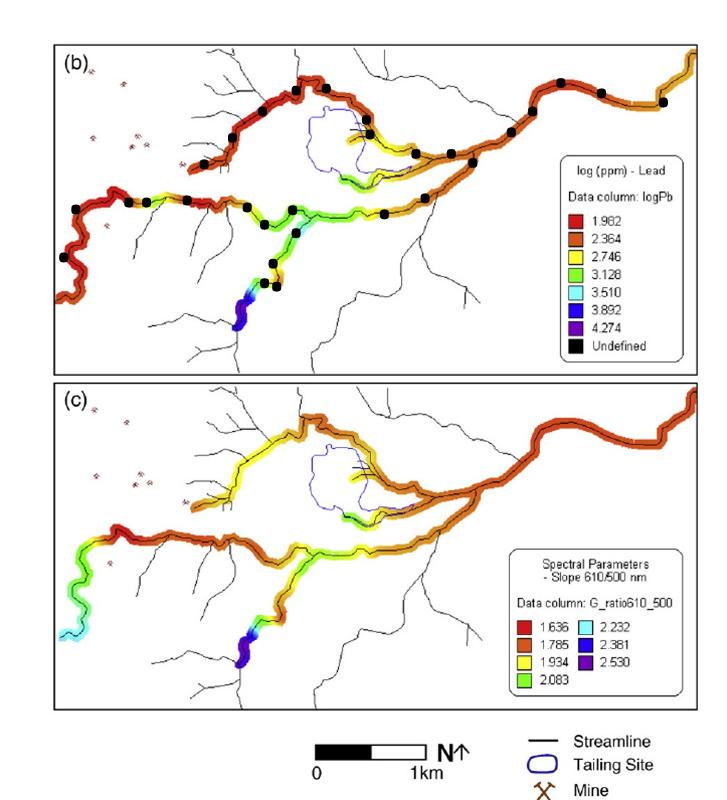
The maps below show a system of drainage rivers around a mining operation in southern Spain. Mine locations are shown on the map, along with the location of a mine tailings site (outlined in blue). The collection locations of the sediment samples that were used for this study are marked by black dots. The colors along the river channels represent different concentrations of Pb as inferred from the laboratory analysis of the collected samples (upper graph b) or the n1/m1 ratio as determined from the ground spectroscopic measurements (lower graph c). We found in the previous question that the ratio n1/m1 was strongly correlated to Pb concentration. The colors in between the sample points for both maps are based on an interpolation from the sampled locations (using a kriging method—a common method of correlating and interpolating spatially-correlated data).
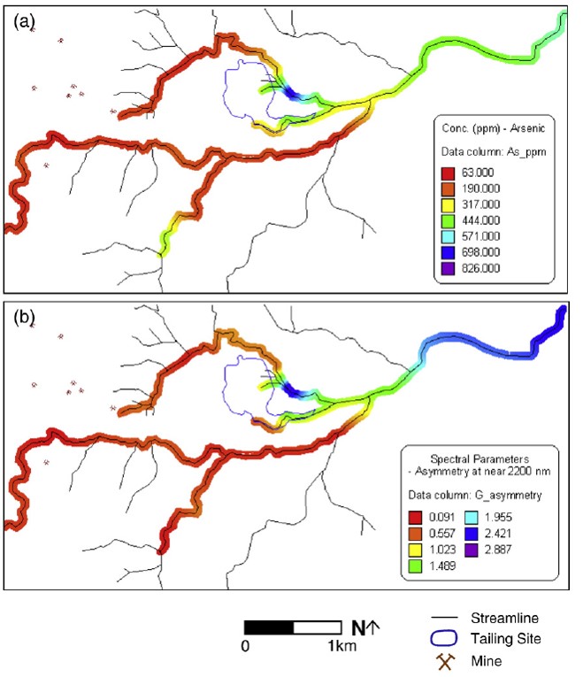
The maps below, analogous to the Pb maps above, plot the lab-measured concentrations of arsenic at the sampled locations (map a) and the assymmetry function for the spectroscopy curve near 2200nm (map b). From "table 3" above we see that the concentration of arsenic is best correlated with this assymmetry value. Again the values between sample locations are interpolated using a kriging method.
The results above are based on 1) laboratory measurements of the chemical composition of collected sediment samples and 2) ground-based spectroscopic analysis of small areas of sediment (10mm wide). None of these data considered true 'remote' sensing which would be done from high elevation and would involve looking at a 'footprint' of the land much larger than 10 mm wide!
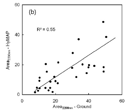
To get an understanding of how their results could be applied to remote sensing data, the authors of the report compare their ground-based spectroscopic results to aerial spectroscopic data of the same region (HyMAP data-- a NASA airplane-based system). The pixel size for the remote data (the 'footprint' size), was 4 meters by 4 meters.
Below is a graph showing a comparison between these data for only a single wavelength parameter, the area under the curve near 2200 nanometers. The R-squared value for this graph (related to the correlation coefficient and a measure of how much of the variation in the data is "explained" by the correlation) is 0.55, which is a rather weak correlation, although the authors report that the correlation is significant at the 95% confidence interval. However, correlations between most of the other spectroscopic parameters were not significant, making the correlation between ground based spectroscopy and remotely-sensed spectroscopy seems even less certain.
last updated 3/15/2022. Text and pictures are the property of Russ Colson, except for text, data, and images from cited research papers.