Problems in Pollutant Migration
Earth Science Extras
by Russ Colson
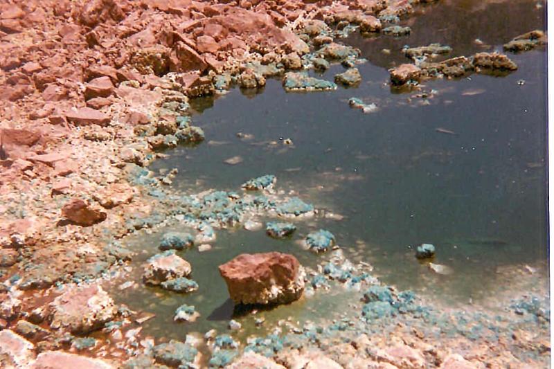
Morenci Copper Mine, AZ, ~1983
Undertsanding groundwater movement is a key compenent in understanding the movement of pollutants, which often move in ground water. Below are three problems that explore pollutant migration via ground water movement, one fictitious and two exploring real-world problems.
The Dump and Gramma Syverson's Well--a fictitious problem in pollutant migration
After a private landfill was put in near their property, both Gramma Syverson and Gramma Knutson decided to have their wells tested for contamination. Gramma Syverson discovered that her well, previously clean, was contaminated. In addition, surface water tests found that the stream between the two properties was contaminated with the same pollutant. In preparation for a lawsuit against the owners of the dump, Syverson and Knutson hired a geologist to study the problem and determine if the Syverson well might have been contaminated by the dump, whether it might have been contaminated by the Syverson's own cattle lot, or if there is some other explanation. The geologist (you) measured the water levels in a number of test wells in the region. Using these data, the geologist (you) contoured the water table depth in the area. Remembering that water flows downhill, and that ground water will flow downhill perpendicular to the water table contours, the geologist (you) further determined the direction of ground water flow and whether or not the Syverson or Knutson wells might be getting contaminants from the new private landfill.
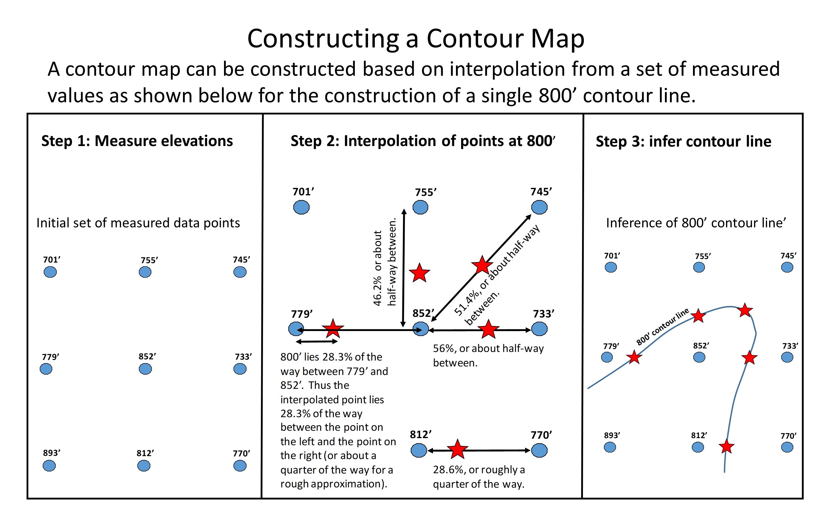
In preparation for your analysis of pollutant migration, you need to construct a water table contour map. This type of map looks like a topograhic map, but instead of plotting lines of equal elevation (topograhic contour lines), a water table map plots lines of equal water table elevation. The illustration below shows how a contour map is constructed. This methods works for water table contour maps (such as we are going to do), topographics maps, weather isobar maps, and many others. Recognize that in the real-world, measured data points are rarely in a perfect grid as shown here.
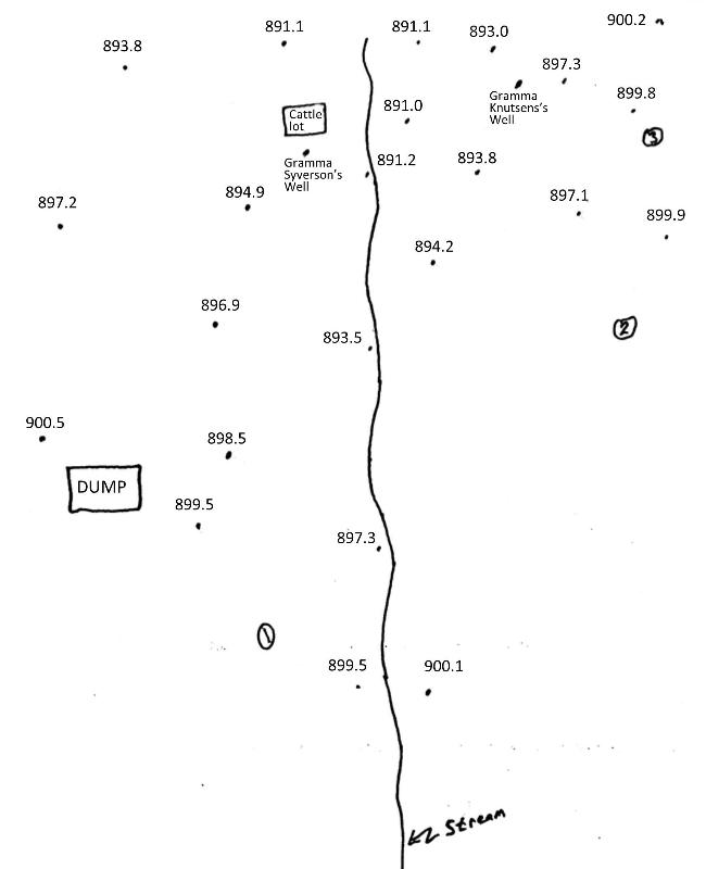
The map below lists the location of test wells and the water table elevation in each (in feet above sea level). Print out this map and construct a contour map of the water table, using the interpolation methods described above. Use a 3 foot contour interval (meaning, draw a contour for every additional three feet of elevation, for example a line for 891', 894', 897' and 900').
When you have a map, check yourself against the multiple choice question below.
A Case Study of Pollutant Migration at Hanford Washington
Construction began at the Hanford site in Washington in 1943 as part of the Manhatton nuclear weapons project. Although the site is no longer active, scientists and engineers have been working for decades to clean up the radioactive waste contamination from 440 billion gallons of cooling water from nuclear power plants and waste water from forty-five years of military plutonium production that was stored in holding ponds that leaked. What do ground water elevations reveal about the likely direction of contaminant migration?
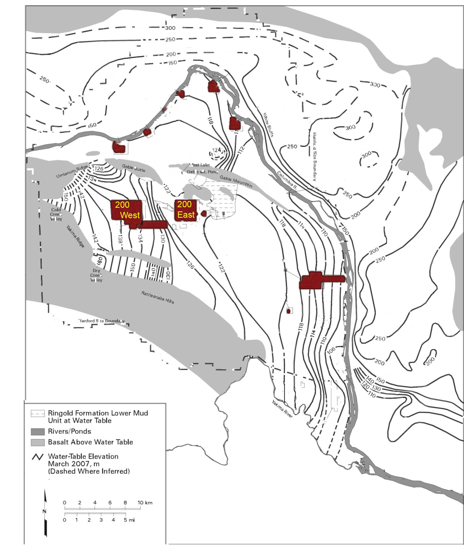
Below is a water table elevation map of the area, modified from the Hanford Site Groundwater Monitoring Report 2007 (DOE/RL-2008-01, Rev. 0). Structures in red show the location of reactors and disoposal ponds and tanks. Let's first spend some time understanding this map. Read the map legend. Find the Columbia River. Figure out which directions are up- or down-gradient.
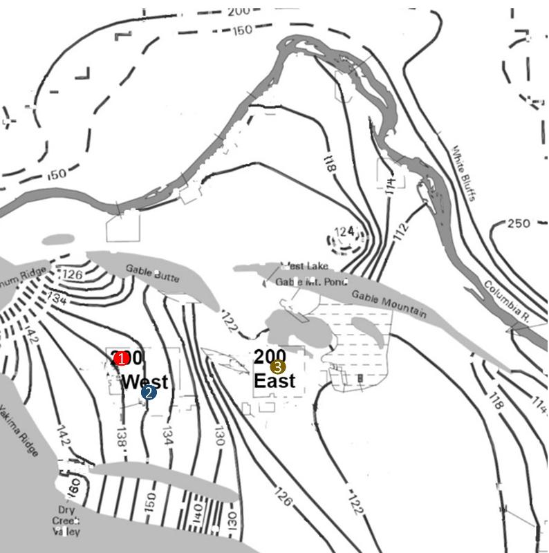
Below is a closer view of the portion of the previous water table map focussing on the region where contaminants were introduced over 45 years. Think about the drection that you expect groundwater contaminant plumes originating at points 1 (red), 2, (blue) and 3 (tan) to migrate based on the water table elevations.
The Plume map below comes from a Fact Sheet about the Hanford Site from the US Department of Energy (captured in 2019). The approximate locations of points 1 and 2 from the map above are included for reference. Do the observed plume trends match our expectations from the question above?
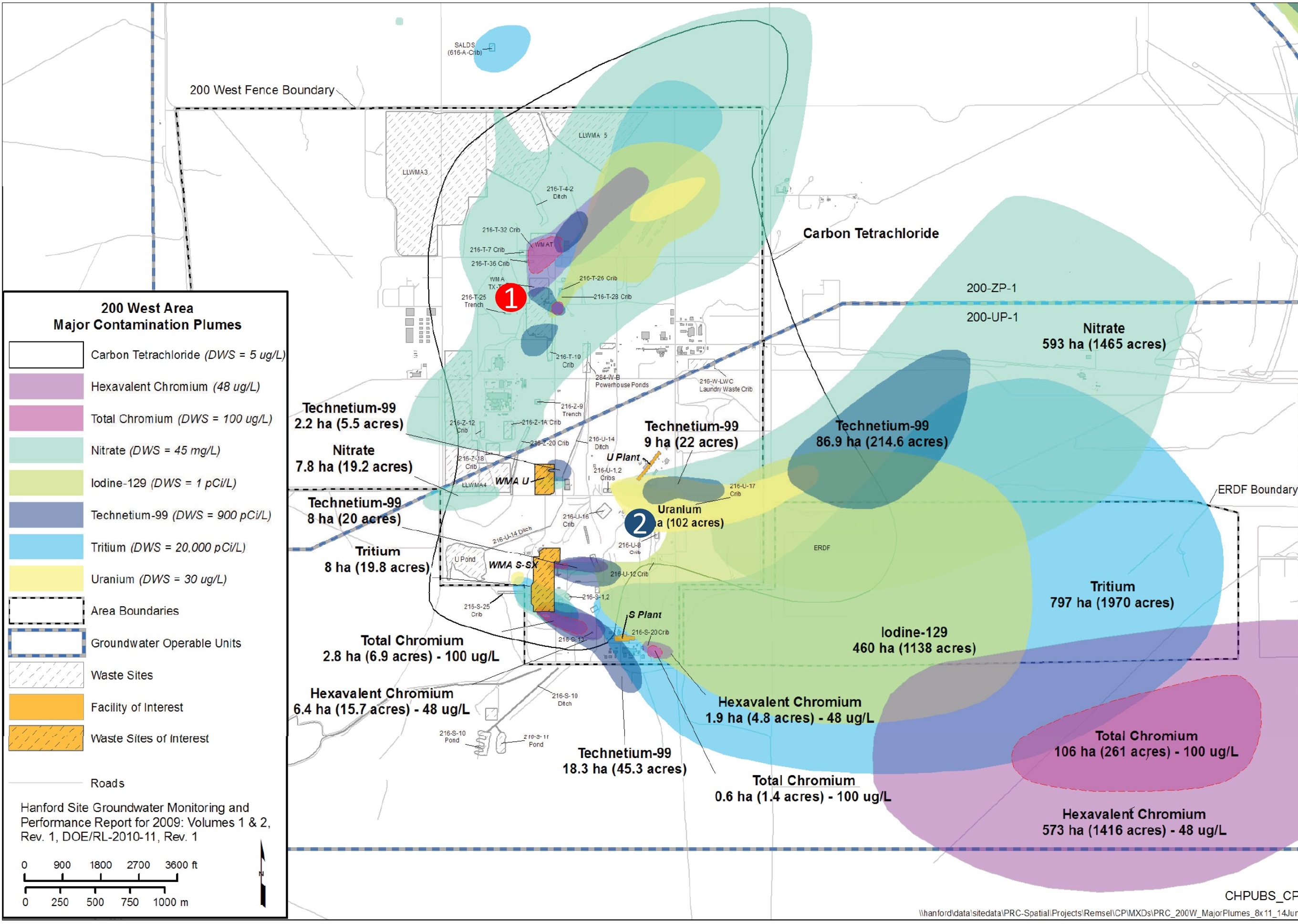
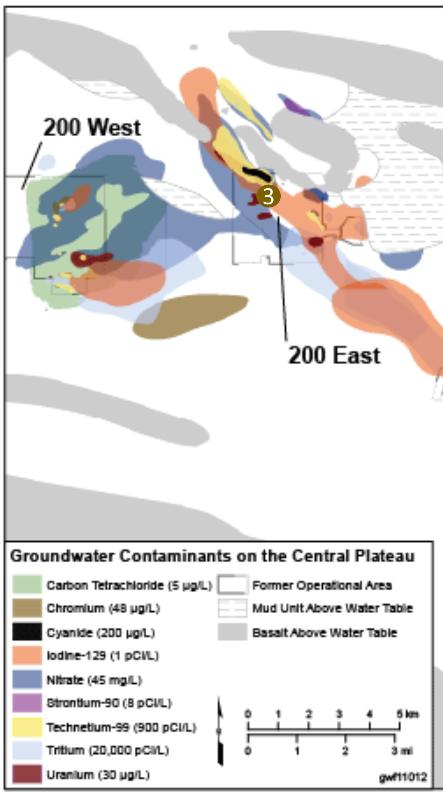
The map below shows the pollutant plumes for both the 200 West (points 1 and 2) and the 200 East (point 3) areas. This map comes from a report to the US Department of Energy, Hanford Site Groundwater Contamination Plume Volumes - 2011 Estimation (above Aquatic Standards and MCLs) CHPRC-02397 -VA. Do the trends from point 3 match the expectations based on water table analysis?
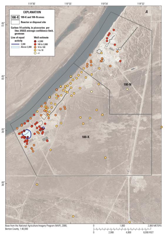
Below is a closer image for the northern part of the Hanford site, including water table elevation contours, adapted from the USGS publication Groundwater Contaminant Plume Maps and Volumes,
100-K and 100-N Areas, Hanford Site, Washington, Open-File Report 2016–1161.
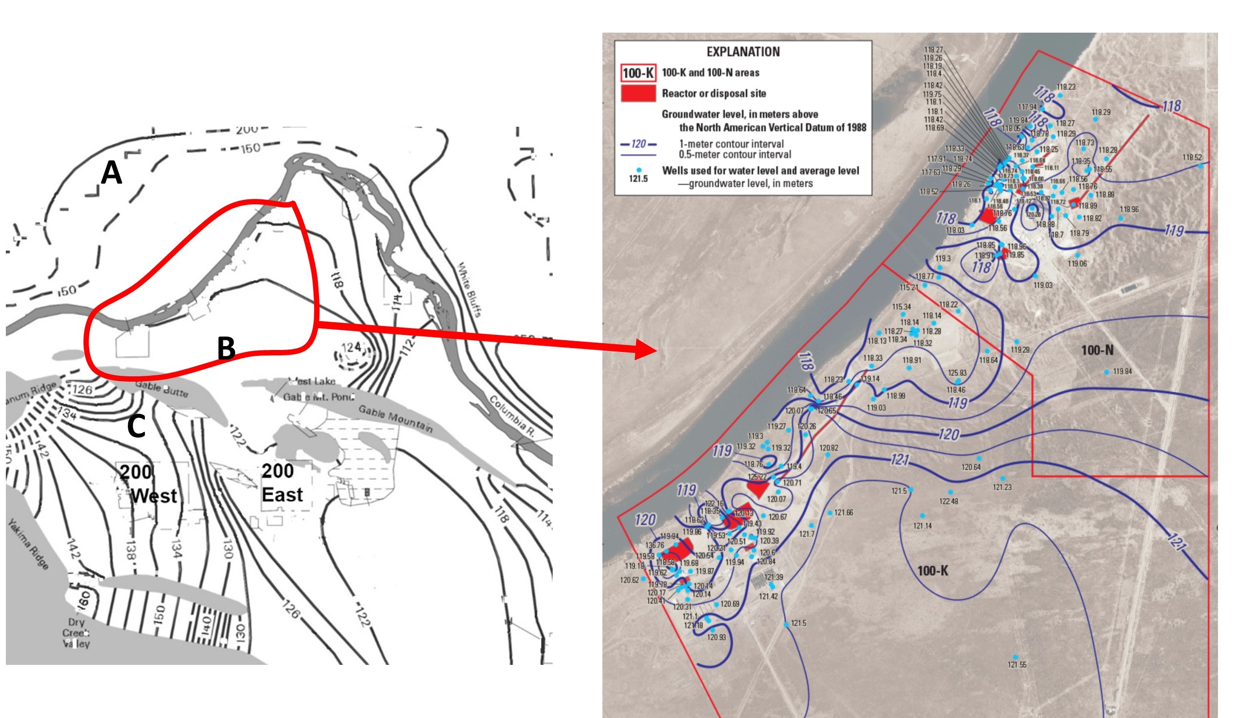
Study the image until you understand the pattern of the water table contour lines, then answer the following question.
Below are the well sample values for C-14 contamination in the grounwater (coming mainly from the western contamination sites, although clearly not all). The trend of concentrations is consistent with a mainly-northwest trend to the ground water, with maybe some northeast drift. From the USGS publication "Groundwater Contaminant Plume Maps and Volumes, 100-K and 100-N Areas, Hanford Site, Washington," Open-File Report 2016–1161. A good exercise might be to construct an argument for why it is unlikely that all of the C-14 contamination is origninating from the sites to the southwest.
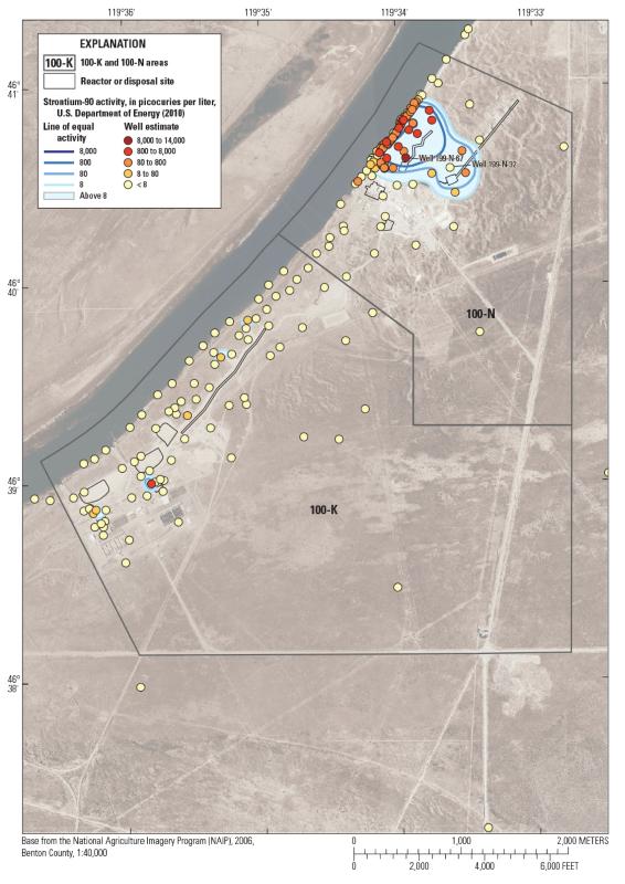
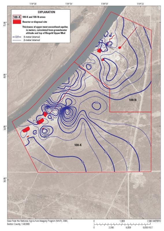
Consider the two maps following, again from the USGS publication "Groundwater Contaminant Plume Maps and Volumes, 100-K and 100-N Areas, Hanford Site, Washington", Open-File Report 2016–1161. The first map shows the concentrations in picocuries per liter of radioactive Sr-90 in the ground water. The second map shows contours of the thickness of the ground water aquifer, from the water table down to an underlying impermeable layer that marks the base of the aquifer. From this information, you can calculate the volume of ground water that is contaminated above a particular concentration level for the Sr-90. You will need to use the map scale and calculate both areas and volumes.
A Case Study of the Clay County Minnesota Landfill
In the 1970s and 80s, landfills were not required to put an impermeable liner underneath a 'cell' of waste when it was put in the ground. Once the waste was covered over from the top, it was considered "closed." However, water seeping down through the waste material could remobilize pollutants in the waste and potentially wash them down to the water table where they would enter the ground water. Cells 1 and 2 at the landfill in Clay County Minnesota were built under this model, and, sure enough, pollutants were detected in the groundwater near the landfill, and beginning in the early 1990s, these cells were re-excavated and an impermeable liner laid down, and then the waste was returned to the landfill. In addition, trees were planted on the side of the landfill where the contamination was detected in an effort to extract the volatile pollutants (VOC= volatile organic compounds, volatile = easily evaporated). The idea was that the volatile compounds would be taken up by the trees and transpired into the air where it would be dispersed by the wind (a phrase from the early days of environmental activism was "dilution is the solution to polution"). Considering the map below showing the water table elevations at the landfill in 1993 shortly after the problem was discovered, predict where you think the trees were planted to protect from seepage from old Area 1.
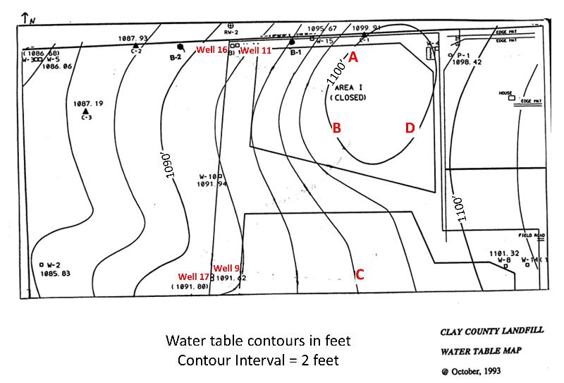
So, did the remediation effort at the Clay County Landfill work? Remediation began in the early 1990s, and as can be seen from the graphs below showing the trend of VOC detected in sampling wells, the concentrations of VOC detected at Wells 9 and 11 generally decreased afterwards. However, the concentrations of VOC at Wells 16 and 17 began increasing again in the 2000s. Did the remediation fail?

To address this question, there is some additional information that you need. Just west of the landfill is a wetlands area where water wells up from a deeper aquifer. Some of the upwellings of water in this region are artesian, meaning that they have a slight over pressure relative to the ground surface.
Additionally, Wells 16 and 17, although geographically close to Wells 9 and 11 as seen in the water table map, are sampling at a greater depth underground.
After digging up and reburying the material from Areas 1 and 2, new landfill activities were resumed but only at one of the two areas; the other was left fallow.
Consdering this information, and the trends seen in the VOC graphs above, try to come up with an explanation for the trends of the VOC and decide whether or not the remediation has failed. If you can, explain your arguments to someone else, and have them present their argumens to you. Be sure to include the observational evidence in your arguments and why that evidence supports your thesis.
When you have spent some time thinking about this problem, test your ideas against the models proposed in the multiple choice question below.
Spend some time sketching out a cross-sectional view of the model that is inferred in the previous question. To do this, you will need to figure out what the model is saying about how things are working. On your sketch, include the locations of upper and lower aquifers, a clay-rich aquitard, regions of upwelling water and artesian conditions, the water table for the upper aquifer, the surface of the earth, and the locations and depths of the wells (W9 and W11) and (W 16 and W17).
last updated 4/22//2020. Images from US government publications are as indicated in the text. Other text and pictures are the property of Russ Colson.