Earth Science Extras
by Russ Colson
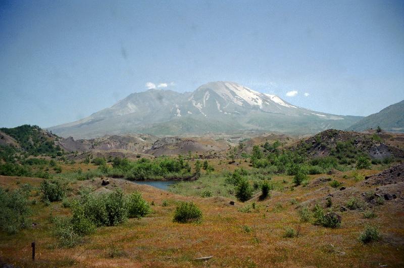
Mt St. Helens, decapitated by the violent eruption of 1980. The rolling landscape in the foreground is the hummocky remnants of a debris avalanche, a rocky flow of pieces of mountain top that roared down the valley like a liquid. This debris flow is the largest avalanche known, averaging 150 feet deep over the 14 miles of valley that it covered. Prior to this eruption, the signicance of a debris avalanche as one of the risks of an explosive volcano was not well known or understood. Now, the debris avalanhe joins other volcanic risks, such as mud flows (Lahars), ash flows (Nuee Ardentes), and lava flows. I took this picture in 2004, 24 years after the volcano erupted, taking 57 lives, including 21 who were never found. As of this writing, you can see an animation of photos taken of the start of the landslide at https://www.youtube.com/watch?v=UK--hvgP2uY.
Natural hazards include not only volcanos, like Mt St. Helens shown in the picture above, but earthquakes, tsunamis, tornados, hurricanes, wildfires, droughts, blizzards, flash floods, and seasonal floods. In fact, each of these "big picture" events has many individual hazards associated with it: for example, hazards from a volcano include lahars (the most deadly), ash flows (the most inescapable), lava flows (destructive to property), and ash falls, as well as the catastrophic landslide seen above. Hazards from hurricanes include the storm surge and flooding from rainfall, as well as dangers from high winds (the one that gets the headlines but often less destructive and deadly than the other two). What's more, different hazards can be correlated to each other, like wildfires can be correlated to drought, or tsunamis can be correlated to earthquakes and explosive volcanism.
In the maps below, we are going to think about the global distribution or various hazards, spatial correlations of those hazards, and some of the causes of those spatial distributions and correlations.
In preparation for these challenges, I show below maps of tectonic plate boundaries and global wind patterns to which we will correlate some of the hazards.
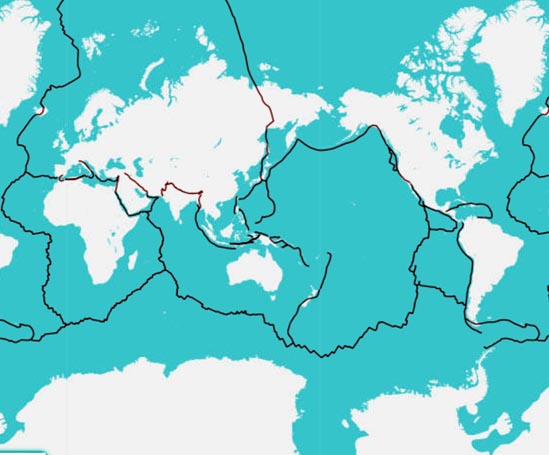
Below is a map showing plate tectonic boundaries of earth (divergent, convergent, and transform). This map is from the United States Geological Survey at https://earthquake.usgs.gov/earthquakes/search
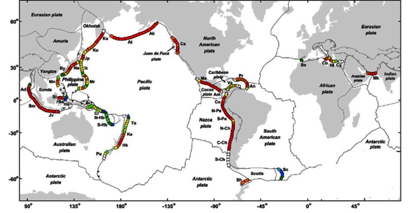
The map below shows subduction zones, those plate boundaries where convergence plus subduction is occuring. This map is from the research paper "Global correlations between maximum magnitudes of subduction zone interface thrust earthquakes and physical parameters of subduction zones" by Wouter P. Schellart and N. Rawlinson 2013 Physics of The Earth and Planetary Interiors 225:41–67, DOI:10.1016/j.pepi.2013.10.001, as provided by the author at https://www.researchgate.net/figure/Global-map-of-the-active-subduction-zones-where-the-200-km-trench-segments-have-been_fig8_259092974
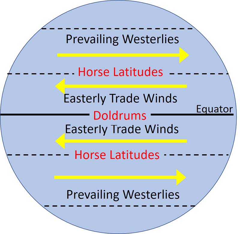
The illustration below shows the prevailing winds at the surface of the Earth. These winds arise due to global circulation with air rising at the equator, sinking at the poles, and breaking up into several circulations cells. This circulation, plus coriolis effects, yields the easterly trade winds and prevailing westerlies..
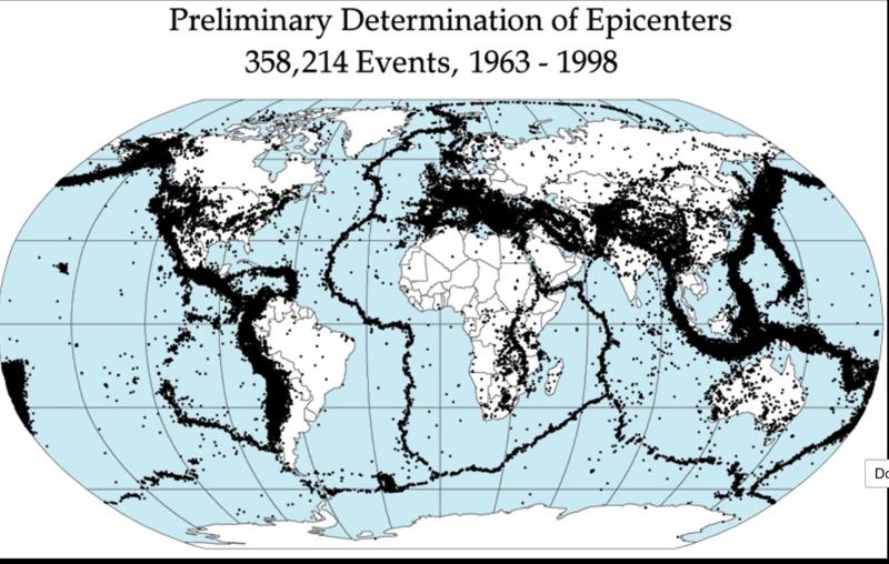
Consider the map below showing the distribution of earthquakes from 1963 through 1998. This map comes from NASA via Wikipedia: ( NASA, DTAM project team - http://denali.gsfc.nasa.gov/dtam/seismic/, Public Domain, https://commons.wikimedia.org/w/index.php?curid=35429)
Consider the map below showing Earthquakes of magnitude of 7.5 and greater from 2010 through 2022. The data and map are from the USGS at https://earthquake.usgs.gov/earthquakes/search.
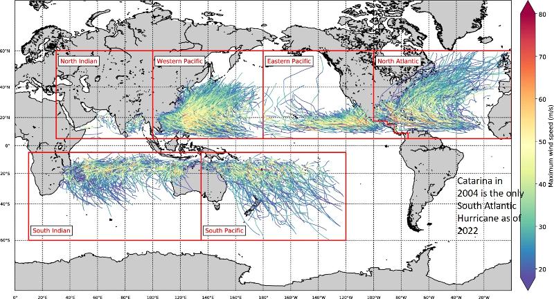
The map below shows hurricane tracks for a large number of hurricanes (based on 38 years of observational data extended by statistical means to cover a 1000 year period of time). This map comes from the research article by Bloemendaal, N., Haigh, I.D., de Moel, H. et al. "Generation of a global synthetic tropical cyclone hazard dataset using STORM". Sci Data 7, 40 (2020). https://doi.org/10.1038/s41597-020-0381-2
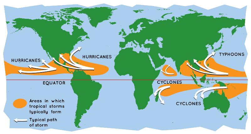
The map below, courtesy of NASA via https://www.floridamuseum.ufl.edu/exhibits/online/hurricanes-climate-change/, shows a conceptualized view of storm tracks like those shown above. (note: Intense tropical cyclones are called hurricanes in the Atlantic and eastern two-thirds of the Pacific, typhoons in the north western Pacific, and cyclones in the south Pacific or Indian Ocean).
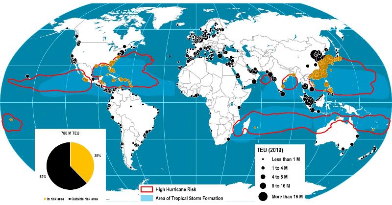
The map below shows the hurricane risk to global shipping (from https://porteconomicsmanagement.org/pemp/contents/part6/port-resilience/hurricanes-global-container-ports). TEU stands for Twenty-foot Equivalent-Units and is the number of 20-foot containers shipped from that port.
Risk of Hurricanes for Global Container Ports, 2019
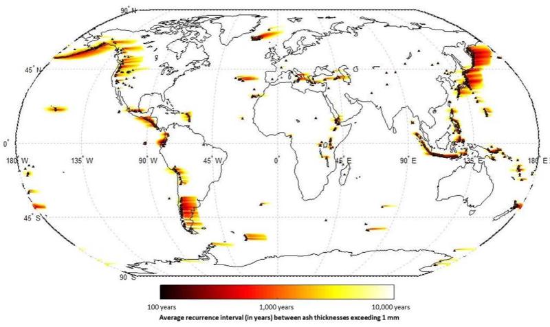
The map below shows the risk for volcanic ash fall (one of the risks of volcanic eruptions that also include ash flow, mud flow, debris avalanche, and lava flows). It plots the average time interval between deposits of at least 1mm of ash. This map comes from Jenkins SF, Wilson TM, Magill CR, Miller V, Stewart C, Marzocchi W, Boulton M (2015) Volcanic ash fall hazard and risk: technical background paper for the UNISDR 2015 global assessment report on disaster risk reduction. A report by the Global Volcano Model and the International Association of Volcanology and Chemistry of the Earth's Interior.
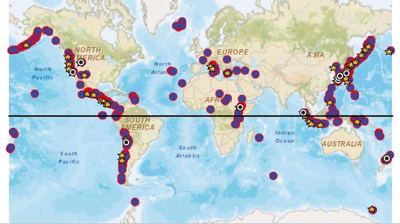
The map below shows the distribution of Quaternary explosive eruptions over the last 100 thousand years. Of particular interest for this puzzle is the largest eruptions during this time, marked by the yellow stars and black circles (M7-7.9 and M ≥ 8 sized-eruptions, corresponding to >100 cubic km and >1000 cubic km erupted material respectively--for comparison, Mt St Helens erupted only about 2.8 cubic km material). This map is from "Characterisation of the Quaternary eruption record: analysis of the Large Magnitude Explosive Volcanic Eruptions (LaMEVE) database" by Sarah Krystyna Brown, Helen Sian Crosweller, Robert Stephen John Sparks, Elizabeth Cottrell, Natalia Irma Deligne, Natalie Ortiz Guerrero, Laura Hobbs, Koji Kiyosugi, Susan Clare Loughlin, Lee Siebert & Shinji Takarada, Journal of Applied Volcanology volume 3, Article number: 5 (2014).
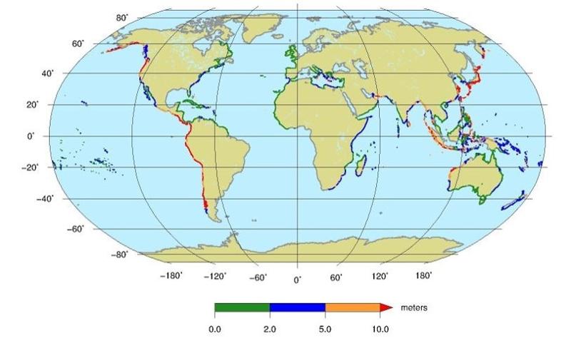
The Tsunami Risk map below comes from https://www.ngi.no/eng/Services/Technical-expertise/Tsunamis/Global-Tsunami-risk-modelling-web-service and reports the tsunami inundation hazard performed for the Global Risk Model carried out for United Nations Office for Disaster Risk Reduction (UNDRR) relate to the 2015 Global Assessment Report (GAR15).
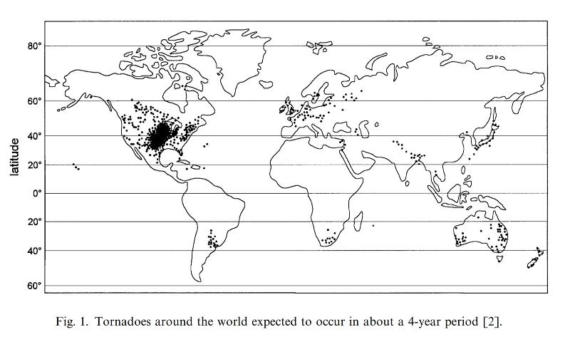
The map below shows the frequency of tornados (of any intensity) around the world. This map is from Goliger, AM and Milford, RV. 1998. Review of worldwide occurrence of tornadoes. Journal of Wind Engineering and Industrial Aerodynamics, vol 74-76, pp 111-121.
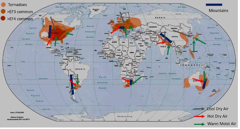
Obviously the United State is the"winner" in tornados! USA has more tornadoes than everyone else in the world combined. The map below, developed from several sources, shows that the intensity of tornados is also greater in the USA, with a large region where EF4 tornados (those with wind speeds between 116 and 200 mph) are common, something no other region has. Clearly, something is special about the USA (we always knew we were special).
The base map below is modified from the NOAA public domain map taken from https://en.wikipedia.org/wiki/Tornado_climatology#/media/File:Globdisttornado.jpg Other features added to the map include arrows to show movement of hot, dry continental air masses (red), cold, dry continental air masses (grey), warm, moist maritime air masses (green), a placeholder for mountains in the proximity (blue). and shades of brown for common occurrence of tornados of various intensities.
Climate change has the potential to affect many natural hazards and risks in our environment. However, one simple effect is to cause melting of land-based glaciers and thus cause a rise in sea level. This rise in sea level will not only directly affect low lying coastal areas, possibly flooding farmland and making cities more difficult to maintain, but will make low lying areas more vulnerable to other risks, such as hurricanes or tsunamis.
The map below comes from https://www.c40.org/what-we-do/scaling-up-climate-action/adaptation-water/the-future-we-dont-want/sea-level-rise/ . It shows cities at risk from a sea level rise of 0.5 metres by 2050s [These are cities projected to receive at least 0.5 metres of sea level rise by the 2050s under a high-carbon emissions scenario called RCP8.5--take note that this is not a 'most-likely' scenario, but a pessimistic high-carbon scenario. As we learned in a previous lesson, climate change models are quite good at predicting climate change based on a particlar carbon-production scenario, but are not as good at predicting how much carbon people will choose to release into the atmosphere through personal behavior and politics]

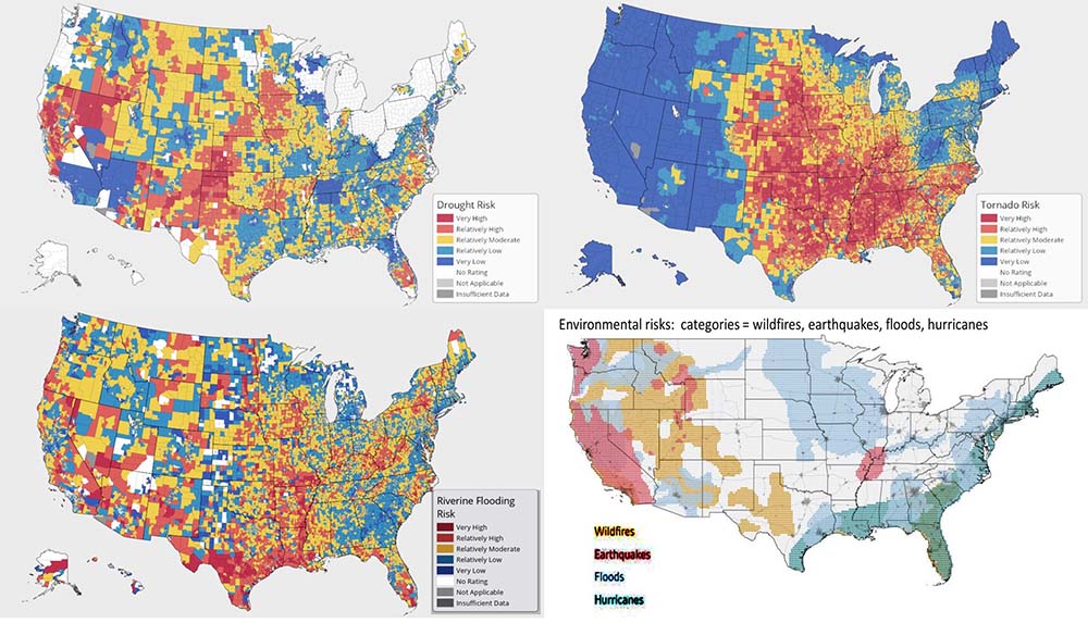
Consider the natural hazard risk maps below. The maps of drought, riverine flooding, and tornado risk are from FEMA (https://hazards.fema.gov/nri/drought; https://hazards.fema.gov/nri/riverine-flooding; https://hazards.fema.gov/nri/tornado) The fourth map, showing risk regions for earthquakes, wildfires, hurricanes, and flooding, is from McHarg Center project 2100 an Atlas for the Green New Deal, https://mcharg.upenn.edu/2100-project-atlas-green-new-deal.
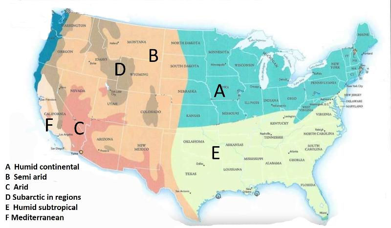
Let's take another look at the drought map from FEMA, reproduced below, and compare it to average rainfall and climate zone maps. The average rainfall map comes from the US Weather Service, https://water.weather.gov/precip/. The climate zone map is modified from GeoNova, a GIS org of Nova Scotia that has map products for general or educational use.
Do you see any patterns correlating the drought risk to the precipitation of climate zones?
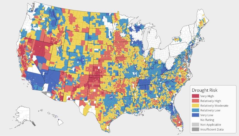
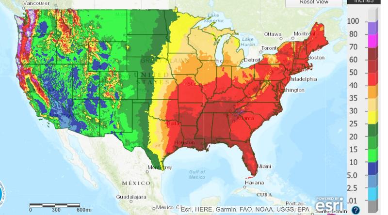
Notice that you can infer from the maps above that drought is not a particlar amount of rainfall, but rather a deviation from typical rainfall, such that crops, lifestyles, etc that are accostomed to one expectation instead experience something different. For example, droughts can occur not only in arid regions like Nevada, but in moderate rainfall regions like the great plains, and even in wetter regions like Arkansas, Florida, and North Carolina.
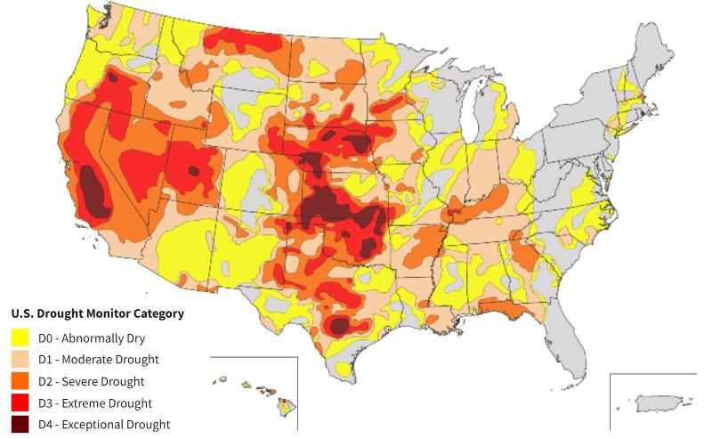
Below is a '"current" drought map for Nov 25, 2022, from https://www.drought.gov/ The drought risk map from above is reproduced below for convenience in comparing. Are there correlations between the "risk" map and the map of actual drought conditions?
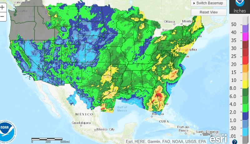
The map below shows total precipitation for the 60 days prior to the drought map shown above (60 days prior to Nov 25, 2022) (this map is from https://water.weather.gov/precip/
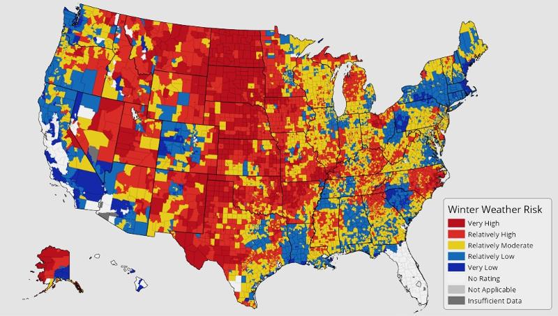
Below is the FEMA risk map for winter weather. This map is from https://hazards.fema.gov/nri/winter-weather. Winter Weather consists of winter storm events in which the main types of precipitation are snow, sleet, or freezing rain. Look at the pattern of the map and think about what it tells us about the meaning of 'risk' of winter weather. Are these regions of colder temperature? Higher precipitation? Higher snow fall? What makes these particular regions of greatest risk?
Flash floods are different from seasonal floods or other riverine floods that are slow to develop. A flash flood is a mostly unpredictable event arising from a short, intense burst of precipitation in a region, leading to rapid and dangerous rises in water level. In contrast, some types of floods develop more gradually (inexorably). For example, seasonal floods along the Red River of the North, caused by snow melt and spring rains, can be somewhat predicted based on ground saturation, snow pack, and expected melting rates. Floods of the lower Mississippi, say south of Missouri, depend on water funneling into the river through many branching tributaries, including the Missouri, northern Mississippi, and Ohio rivers, and can take many weeks to develop as the waters move down these tributaries toward the lower Mississippi.
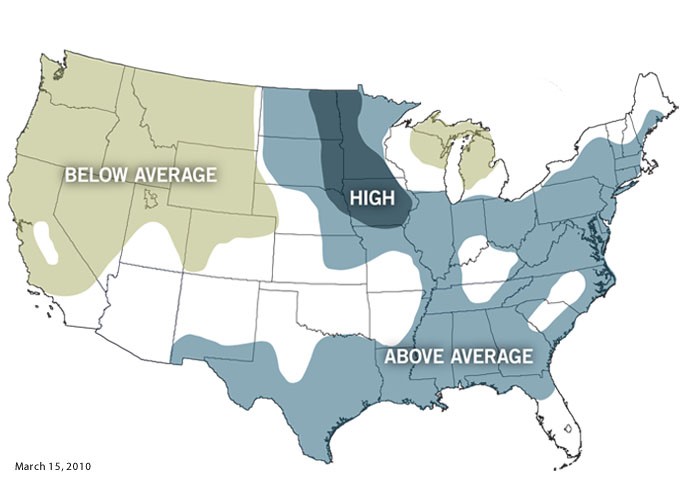
Below is a spring forecast map showing an estimate of seasonal flood risks based on snow pack, soil saturation, and other factors, released by the US government (CLIMATE.GOV STAFF) March 18, 2010. A forecast is not a prediction of exactly what will happen, but rather an assessment of possibilities so that local governments can prepare, thus the map presents regions of higher or lower than average risk. This map was reason for unease in Fargo ND in 2010, since 2010 was just one year after the historic flood of 2009. However, 2010 did not repeat the 2009 crest level.
One type of "risk" is simply the chance that a particular severe event will occur in a region over a particular period of time. Is that event more or less likely to occur in that area than in other areas? Many of the 'risk maps' above are this type of risk.
Another type of risk is the number of people whose lives are in jeopardy. Two events of the same severity, one in a sparsely populated area and another in a densely populated area, will affect different numbers of people. We thought about this implicitly when we considered the affects of rising sea level on coastal cities (not agriculture land) in the problems above.
A third type of risk assessment considers the value of property or infrastructure that is at risk. How much will an event affect commerce, productivity, and life going forward due to the need to rebuild expensive infrastructure? We considered this type of risk for hurricanes in thinking about the fraction of shipping capacity that is in hurricane-prone regions in one of the problems above.
Also, some populations might be more vulnerable than others. Earthquakes of magnitude 5-6 will do little damage in some regions with well built structures, but cause immense damage and loss of life in other regions with more cheaply built structures. Some populations have the resources and skills to quickly rebuild while other populations may not have those resources and skills.
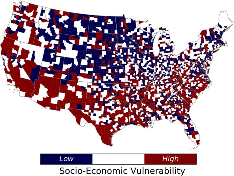
One example of an effort to include vulnerability of populations comes from the research article "A Place-based Assessment of Flash Flood Hazard and Vulnerability in the Contiguous United States" by Sepideh Khajehei, Ali Ahmadalipour, Wanyun Shao & Hamid Moradkhani, Nature Scientific Reports volume 10, Article number: 448 (2020), https://www.nature.com/articles/s41598-019-57349-z/figures/4
Taking into account multiple factors, they derive a measure of socio-economic vulnerability, plotted on the map below.
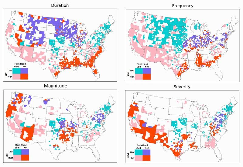
They then suggest that "risk" from flash flooding is better understood by taking into account the socio-economic vulnerability of different regions of the country as well as several different measures of the extremity of the flood. The maps below are a portrayal of their results, taken from The University of Alabama news, https://news.ua.edu/2020/02/southern-u-s-hotspots-for-severe-consequences-of-flash-floods/
To read and understand these graphs, notice that each graph plots something different: flood duration, flood frequency, flood magnitude, and flood severity (magnitude = peak flow, severity = magnitude/duration). "Hot" refers to regions with more than average risk for that characteristic and "Cold" to regions of below average risk for that characteristic. A high SEVI (socio-economic vulnerability index) corresponds to communities with more limited resources or infrastructure for dealing with disasters. A low SEVI corresponds to communities who are better able to respond.
Thus:
The authors of the study comment that "Our methods and tools can have immediate applications for city planning, emergency management and flood insurance, and our research can help vulnerable and disadvantaged communities to cope with adverse effect of flash floods and improve the resilience of these communities,"
last updated 11/27/2022. Text and pictures are the property of Russ Colson, except as noted.