Mineralogy-More Phase Diagrams, Free Energy Diagrams, plus 3 and 4 Component Phase Diagrams
Earth Science Extras
by Russ Colson
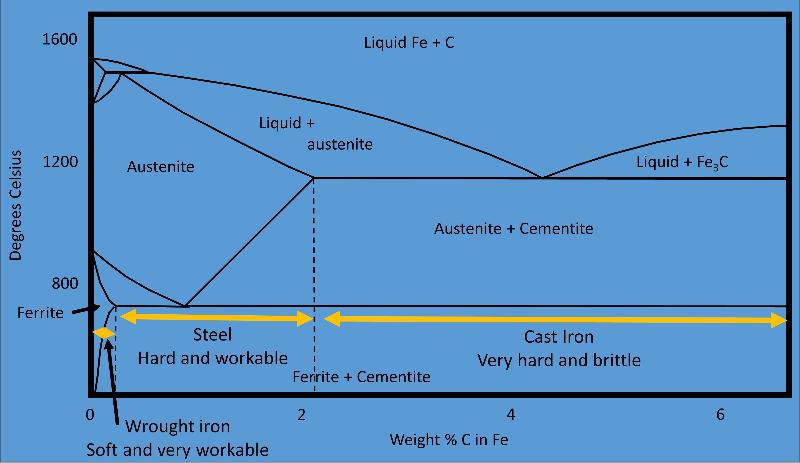
Phase diagram used to understand the manufacture of steel, a process begun over 3200 years ago. Manufacture of steel requires the formation of austenite and its recrystalliization at the eutectic into a mixture of ferrite and cementite.
The relationship between energy of phases and phase diagrams for 2-component phase diagrams
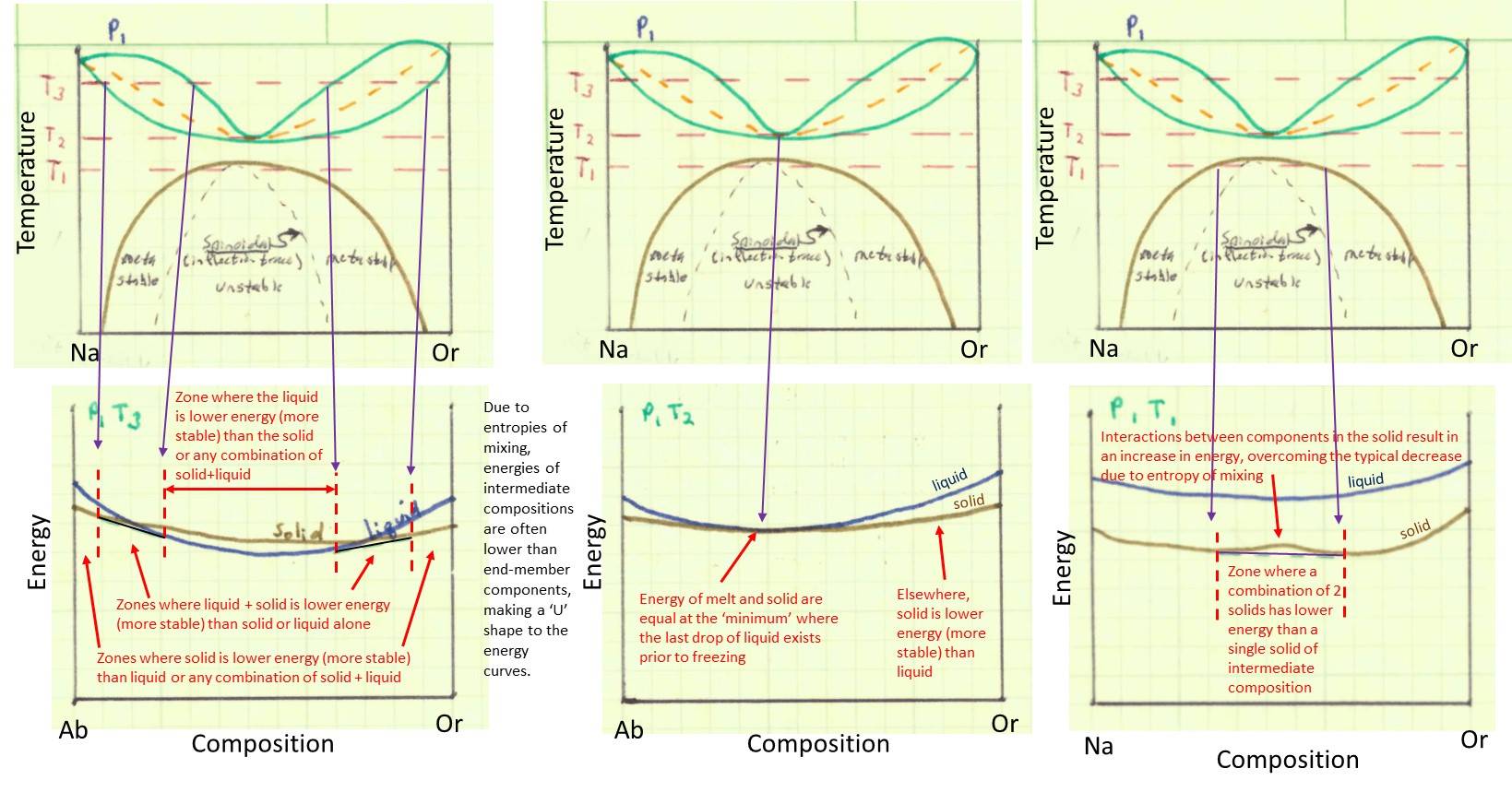
In our previous lesson, we considered briefly the relationship between Gibbs Free Energy and the lines and regions on 1-component phase diagrams. We considered how the diagram reflects relative volumes and entropy.
2-component diagrams also reflect the energy states of the the phases, with the phases that are stable under any particular set of conditions being the phases with the lowest energy (where energy reflects the enthalpy and entropy of the phases as well as an entropy effect due to mixing of components within phases that have either liquid or solid solution. In the illustrations below, the upper row of images shows the phase diagram. The lower row of images shows the qualitative energy of the different phases plotted as a function of the composition of the phase. Notice how the energy decreases toward the middle composition of solutions--this is a consequence of the entropy of mixing. The lowest energy phase, or combination of phases, is the phase or phases that will be stable at a particular temperature and composition. Take some time (more than just a few minutes--there's a lot to read and understand!!) to work through the illustrations below, figuring out what they mean. The brown lines in the energy diagram are the energy of the solid phase, the blue lines are the energy of the liquid phase. Sometimes a combination of liquid and solid will have a lower energy (shown by the black tie-line) than either liquid or solid alone. Think about how the different phase fields result from changes in energy with temperature. Be sure to recognize that the energy diagram for temperature T3 is shown on the left, the energy diagram for T2 is shown in the middle, and the energy diagram for T1 is shown on the right. Recognize that the black tie lines connecting two different phases on the energy diagram shows the linear sum of energies of the two phases, where the sum of the two phases is lower energy than the energy of any one phase alone. Notice that the brown line representing the energy of the solid has a "bump up" in the lower right hand image. This is caused when a 'repulsive energy' between the Na-rich and K-rich (Or) components in the melt overcomes the entropy effect of mixing the two components. This occurs as temperature decreases and the entropy effect becomes less.
When you have studied the diagrams above and understood them, test yourself with the following questions.
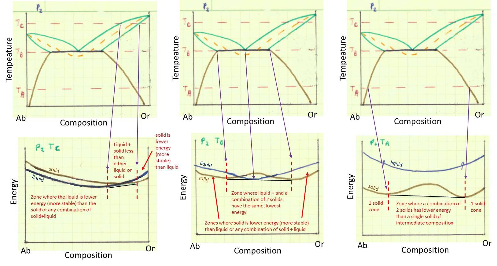
Remember from our previous lesson that increasing the fluid pressure causes the 'bunny ears' to go toward lower temperature and eventually intersect with the solvus curve. If we consider a conceptual illustration of energy for the phase diagram at higher fluid pressure, we get something like that below. Again, study the illustration to understand the concepts in it. Consider how fairly complex phase diagrams can arise from simple variations in energy wtih temprature and composition. Recognize that, again, the top row of pictures shows the phase diagram, the bottom row of pictures shows the qualitative free energy diagrams for the temperatures TC (left most), TB (middle) and TA (right most).
Can't get enough of these energy diagram and the connection between energy and the phase diagram? You can check out how a system without solid solution works in the question below (there are no points with this question, it's just an extra).
Three-component (ternary) phase diagrams
You might think that we won't be able to plot a three-component phase diagram in 2-dimensional space, but we can do it (in cases where the total is 100%) through the use of a ternary diagram and ploting temperature as contours (like topographic lines) on the diagram.
Reading Ternary Diagrams
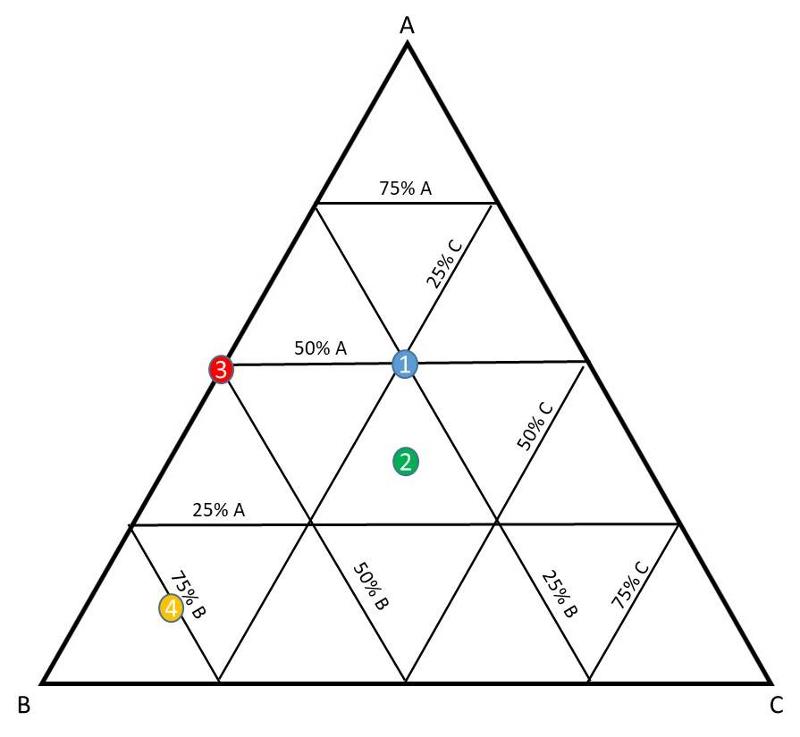
Let's first think how to read a ternary diagram. On a ternary diagram, every point is made up of the three plotted components, and adds up to 100% total, as shown below.

Consider the following designated locations in the diagram.
Example Ternary phase diagram
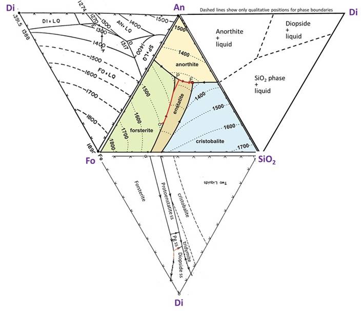
The ternary diagram below shows the three components Mg2SiO4 (Forsteritic), CaAl2Si2O8 (Anorthitic), and SiO2 (quartz-itic).
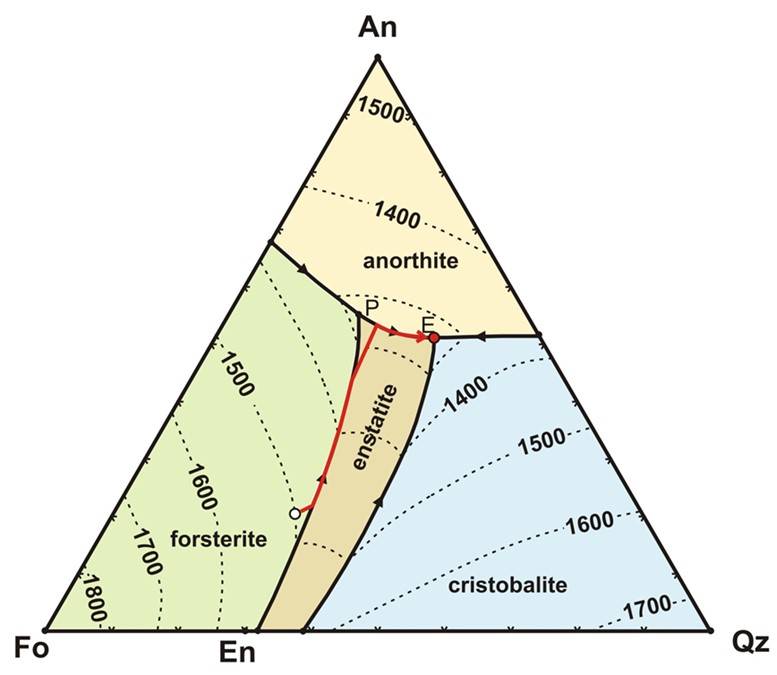
Fields on the diagram show where different phases are at equilibrium. The temperatures for the liquidus are shown as contour lines. For any given composition you can infer at what temperature the liquidus temperature is encountered and crystallization begins. On the diagram above, the red line showns the trajectory of how the liquid composition will change with decreasing temperature for one particular bulk composition (we used the liquidus curve to do this in the binary diagrams)
Once Forsterite starts to crystallize, the composition of the remaining melt will change--moving directly away from Fo on this diagram (that is, the melt is being depleted in Fo as crystallization proceeds, so its composiiton must move directly away from Fo toward more An and Qz). This melt migration is shown by the red line on the diagram. This continues until the melt encounters the forsterite-enstatite reaction curve. At this point, pyroxene begins to crystallize, This reaction curve is analogous to the peritectic reaction examined in the Fo-Qz phase diagram in the previous lesson.
The melt composition will follow the reaction curve until all of the Fo is reacted away. At this point, only enstatite will be crystallizing, so the melt composition will migrate directly away from Enstatite on the phase diagram, as shown by the red line. It will follow this trajectory untl Anorthite begins to crystallize, whereupon it will follow the curve to the ternary eutectic point (marked by an "E"), where the last melt will co-crystallize En, An, and Cristobalite.
Example ternary diagram showing the 2-component diagrams along the binary joins
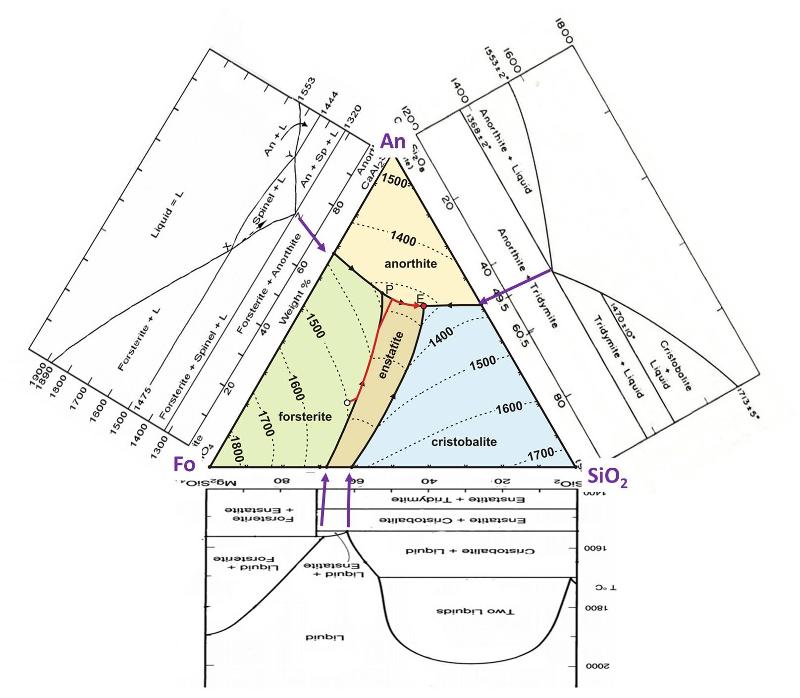
The illustration below shows the Ternary phase diagram, along with the binary phase diagram along each of its edges, that is, the 2-component phase diagrams for Fo-An, An-Qz, and Qz-Fo. Purple arrows are drawn to match up where the binary eutectic and peritectic points correspond to points on the ternary diagram. Notice that the Ternary eutectic and peritectic are at lower temperatures than their equivalent on the binary diagrams--that is, the melting temperature continues to decrease as we add in more components to the melt. Take note that the Fo-SiO2 diagram (upside down in this illustration) is one that we examined in detail in the previous lesson. You can use the binary diagrams to help visualize the liquidus surface, plotted with contours on the ternary diagram. Also, the binary diagrams show subliquidus phases and transitions, which are not shown in the ternary diagram.
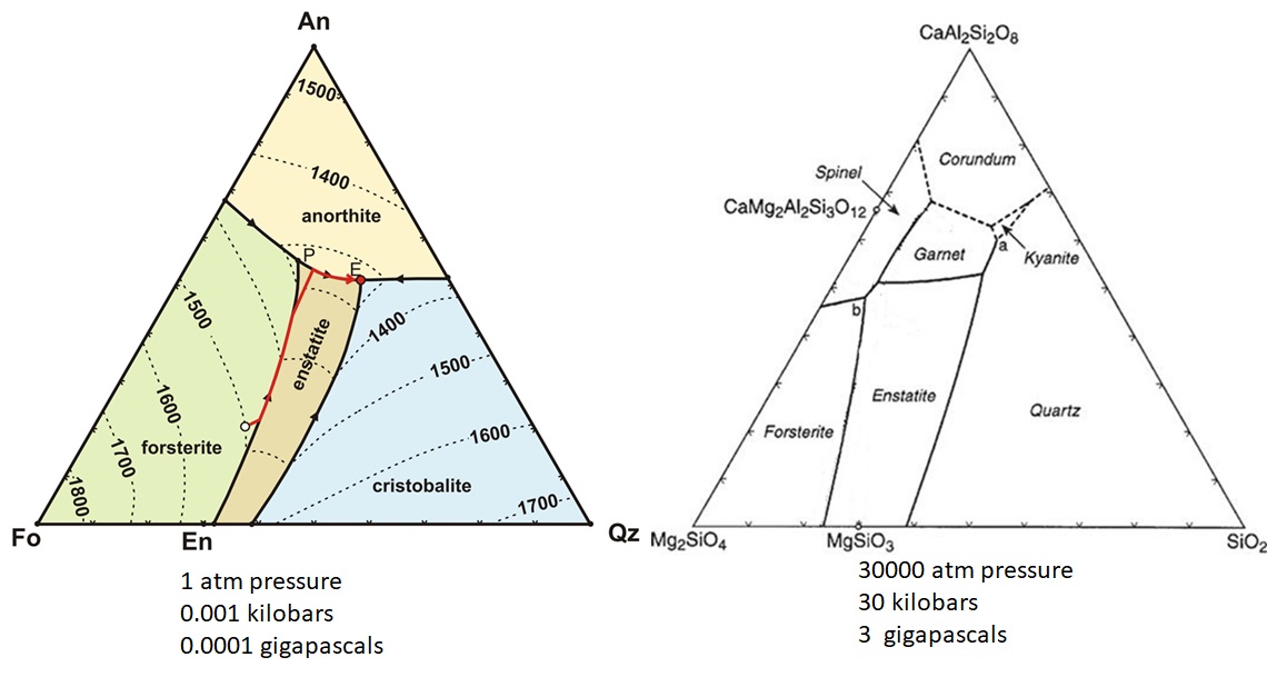
Pressure effects on a ternary phase diagram
Feldspar Ternary
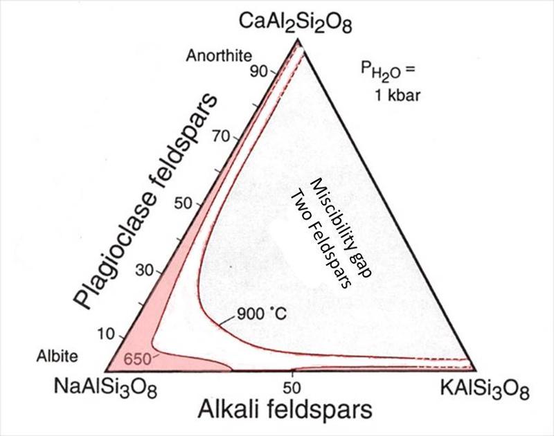
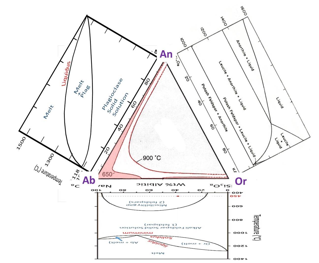
We looked at the 2-component (binary) phase diagrams for each of plagioclase and the alkali feldspars in the previous lesson. Here is the equivalent ternary diagram that combines those two binaries, showing the region where feldspars are miscible (one feldspar of intermediate composition) or immiscible (two feldspars) for two different tempeatures. Notice that the misciblity gap increases as temperature decreases as was also seen on the Or-Ab binary diagram. At 650°C, there is a miscibility gap on the Or-Ab binary, but the plagioclase binary continues to be completely miscible. The misciblity gap at high fluid pressure will be somewhat similar to the gap at 650°C.
Below is the ternary diagram with the binary diagrams that occur along each edge of the ternary--we examined two of the binary diagrams in the exercises in the previous lesson. The third binary that we did not examine (anorthite-orthoclase) shows limited-to-no solid solution. This diagram is called a pseudo-binary because one of the phases that occurs (leucite) does not have a composition that plots on this diagram.
A brief look at a Quaternary diagram
Quaternary diagrams are sometimes visualized as tetrahedrons (trigonal pyramids) with each of the 4 components at one of the apexes of the tetrahedron. We can plot this in two dimensions by opening up the tetrahedron like the petals of a flower. We can't plot liquidus temperatures (easily) on this type of diagram, and it is more difficult to graphically analyze the trajectory of the changing liquid composition as crystallization proceeds. However, it is sometimes useful in understanding where phases occur in a composition that is a bit closer to a natural basalt.
last updated 12/19/2020. Text and pictures are the property of Russ Colson except for the base phase diagrams modified from a variety of sources.
