Mapping Weather
Earth Science Extras
by Russ Colson
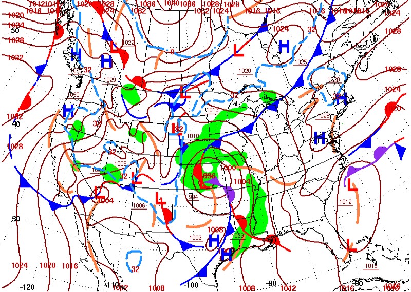
Daily weather map for March 23, 2021 from the NOAA archives at https://www.wpc.ncep.noaa.gov/dailywxmap/index_20210323.html
Exercise in Contour Mapping: Barometric Pressure and Isobars
As we learned in the lesson on topographic maps, contour lines can be used to portray a third dimension on a two-dimensional map. That third dimension might be topographic elevation, as with a topographic map, but it can also be atmospheric pressure, temperature, cumulative rainfall for some period of time, probabilities of rainfall, crop growing degree days, and so on. Contour lines are lines of equal value (equal elevation, equal pressure, etc) that help us visualize the 'third dimension' of data. Constant pressure lines are called isobars.
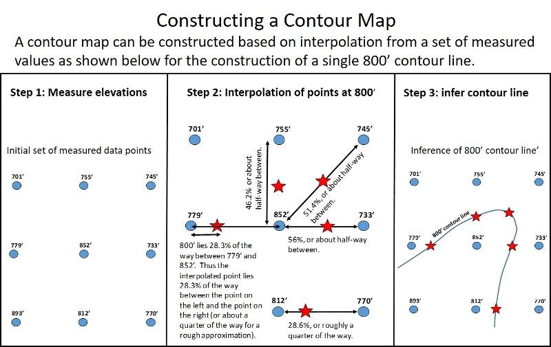
When you see a map that shows barometric pressure contours (like the brown contour lines in the map at the top of this lesson), those contours had to be constructed based on measurements of pressure at the surface at many locations (there is no way to 'detect' contour lines from satellites in space!) Locations of contours are then interpolated from a grid of surface pressure data, just like the contruction of contour lines in our exercises in topographic mapping in a previous lesson. In modern times, this interpolation excercise is typically done by a computer algorithm that estimates where pressure contours should go and constructs the map. However, unless we want to become mindless servants of our computers, it is important that we understand the basis for the computer algorithms that construct the maps (which, of course, some person has to program). Thus, we are going to go through an exercise in construction of a pressure contour line using real data. This exercise is adapted from a middle and high school lesson in the book Learning to Read the Earth and Sky, by Russ and Mary Colson, NSTA Press, 2016.
As a reminder, here is the basics of contour interpolation taken from our previous lesson on topographic mapping:
Consider the map below (from Learning to Read the Earth and Sky) showing measured atmospheric pressure at a number of locations. Pressure is the result of the weight of all the air molecules above you at a particular location, and thus depends both on the elevation (higher elevations will have less air above them) and on variations in the density and height of air at different locations arising due to movement of weather systems ('hills and valleys' of air, so to speak). The pressure values in the chart below have been adjusted to what pressure would be at sea level so as to only consider the 'hills and valleys' of air dependent on weather systems and not the elevation of particular locations. Nearly all pressure maps make this adjustment so as to be more easily and meaningfully interpretted.
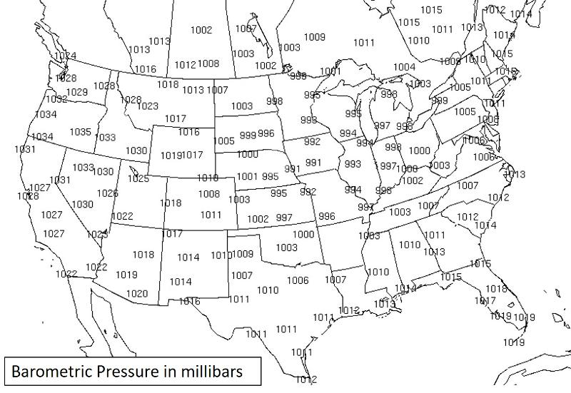
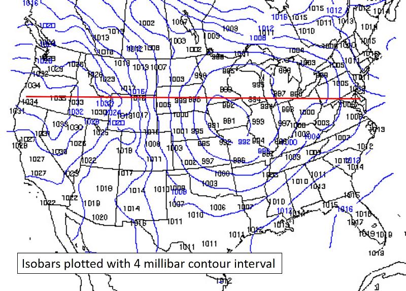
Print out the map and try to sketch in just a single contour, say for 1000mbar pressure. Remember, this is not a connect the dots exercise, but an interpolation exercise. Find the points on the map where we would expect 1000 mbars pressure, and connect those dots.
When you have done this exercise, test yourself with the multiple choice question below.
It's important to practice visualizing what contours mean, that is, visualizing the third dimension. Below is a map in which a computer algorithm has plotted the pressure isobars based on the pressure data in the previous problem, also showing a red profile line (from Learning to Read the Earth and Sky, 2016). On a separate sheet of paper, sketch out what a cross-sectional profile of pressure would look like along the red line (this is analogous to doing a topographic profile with a topographic map). Sketch out how the pressure changes with location on a graph like that shown below. Typically, you can place the edge of a piece of paper along the profile, mark each point where the edge crosses a contour line. writing down the value of the contour, and then place the edge of paper on your graph and mark the pressure at each point. You can search online for 'how to draw a topographic profile' for more detailed directions if you don't remember how to do this.
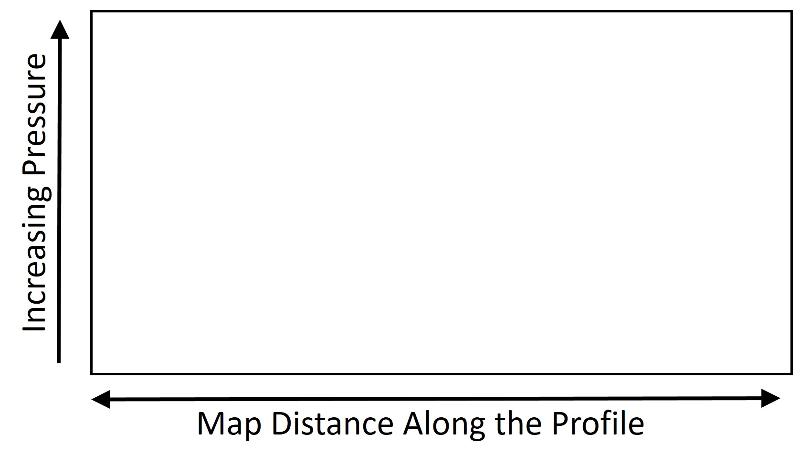
After sketching out your pressure profile on a graph like that shown above, check your understanding with the multiple choice question below.
Excercise in Contour Map Reading: Temperature and Isotherms
Temperature can also be plotted using contour lines. Contour lines of equal temperature are called isotherms. Often, in modern maps, isotherms are shown by colored regions on a map to facilitate seeing the temperature trends and to be visually more appealing. However, this can sometime obscure where, for example, the isotherm lines are closest together (indicating the steepest temperature gradient). Steep temperature gradients typically occur at fronts, either cold or warm fronts, because this is a region where colder air and warmer air are brought into close proximity by dynamic movement of winds and convergence of air.
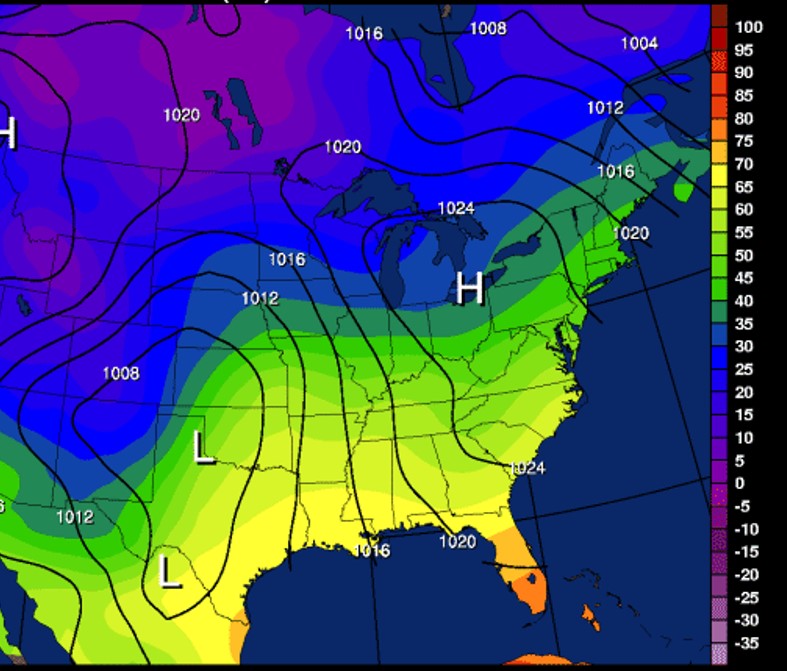
Consider the map below for Dec 28, 2019 from the weather map archives at https://www.atmos.illinois.edu/weather/tree/viewer.pl?launch/sfctmpslp. Where do you think the fronts lie on this map? HInt: The fronts will be in the region of steepest gradient (that is, the area of greatest T change with location). This will be related to the spacing of the isotherms (having a contour interval of 5 degrees as seen in the key at right). It will not necessarily be related to more prominent or less prominet color changes since color change is an arbitary choice of the map maker.
Exercises in Reading Ocean Circulation Maps:
There is a strong relationship between ocean currents, global heat balance, and climate. Let's consider some simple questions in reading maps that show ocean currents.
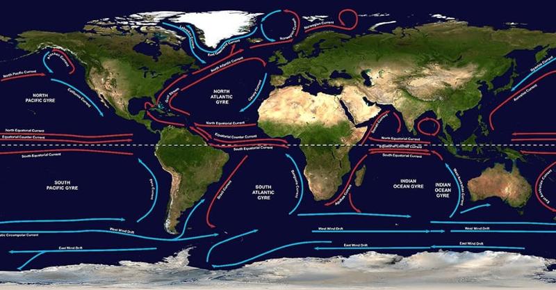
Consider the map below showing oceanic gyres, large scale circulation of ocean water on the scale of entire ocean basins. This map is from https://oceanservice.noaa.gov/facts/gyre.html
In addition to the large surface ocean gyres in the map above, there is also a global circulation of ocean water (taking perhaps a thousand years for a full cycle!) called the thermohaline circulation (thermo relates to temperature, haline relates to salinity). This is shown in the map below. This map is in the public domain from the NASA Earth Observatory and comes from https://en.wikipedia.org/wiki/Thermohaline_circulation on 11-22-2022
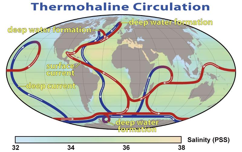
Interesting side note: Notice that the regions of saltier surface water shown on the map above tend to be concentrated in the regions about 30 degrees north and south of the equator where--as we learned in our lessons on climate--descending air tends to suppress precipitation. Thus, these are regions of high evaporation and decreased precipitation, making the sea there saltier.
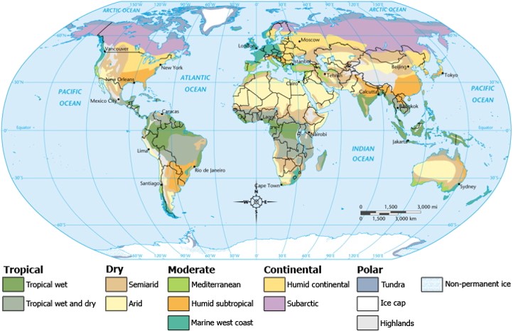
Examining a Climate Zone Map
The climate zone map below is a creative commons map, meaning that I am allowed to use this map (for example, in this case copying, redistributing, and even modifying it), under certain restrictions, such as (in this case) givng appropriate credit (Wikipedia—https://simple.wikipedia.org/wiki/Climate#/media/File:ClimateMap_World.png, Original uploader was Waitak at en.wikipedia Later version(s) were uploaded by Splette at en.wikipedia) , providing a link to the license (Creative Commons License: https://creativecommons.org/licenses/by-sa/3.0/legalcode), and indicating if changes were made (none were except, possibly, changes in resolution).
last updated 11/23/2022. Text and pictures are the property of Russ Colson, except as noted.