Minnesota Lake Geochemistry Lab
Earth Science Extras
by Russ Colson

Introduction to Correlation
Correlation refers to how one characteric or variable changes in sync with another characteristic or variable. For example, changes in Earth's average atmospheric temperature are correlated to changes in the concentration of carbon dioxide in the atmosphere. Concentrations of carbon dioxide and average world temperatures have both increased over the past 150 years. When two variables both increase or decrease together, this is called a positive correlation. When one variable decreases while another increases, this is called a negative correlation. And example of this is that concentrations of Ni (nickel) in Hawaiian basalts generally are higher in samples with lower Yb (Ytterbium), and lower in samples with higher Yb, creating a negative correlation.
The idea of correlation is very important in science. Typically, correlations give us insight into what might be causing changes that we see. For example, it is possible that increasing carbon dioxide in the atmosphere causes temperatures to rise. It might also be possible that increasing temperature can cause carbon dioxide to rise.
Correlation can give us insight into cause, but correlation does not prove that changes in one particular variable are causing changes in the other. For example, I am an early riser. I have noticed that everytime I get up in the morning, the sun will soon rise. This has been a very consistent correlation for my whole life. I might speculate that my rising causes the sun to rise!
Is there any way to know this is not true? Of course! I simply have to do an experiment--I can rise at a different time of day and see if the sun's rising follows me.
It doesn't, thus crushing my nascient hopes that I can control the heavens. It is more likely that this correlation is due to my preference to be awake during the day when I can see and to sleep during the dark of the night.
Sometimes a correlation does not mean that either change is causing the other, but rather that both variables are responding to some third variable that may not be obvious. For example, in the case of the correlation between Ni and Yb cited above, the concentrations of Ni and Yb are both affected by a common causative agent--the crystallization of the mineral olivine in subsurface magma chambers.
Another consideration in understanding correlation is to evaluate whether or not a correlation is statistically significant. That is, sometimes an apparent correlation is simply the result of chance variations. A black cat walks across the road in front of you just before your cousin is killed in a car accident in a different state. There is a correlation, but only between two single events. If you keep records of all the times black cats cross the road, you may be able to find some bad events that happens near that time, but the bad events probably are not well correlated to only those times when black cats cross the road.
Let's consider a more realistic example. You notice that rain often occurs when the wind is in the east. Yet sometimes you get rain when the wind is in other directions. And sometimes when the wind is in the east, you don't get rain. Is there a true correlation between rainfall and easterly winds? Answering this question would require gathering a large number of observations and trying to see if the correlation is noticeable in those large number of observations, giving insight into whether the correlation is significant or not. You might, for example, chart wind direction when its raining and wind direction when it's not raining and see if, over time, there is a clear difference.
In science, we evaluate whether a correlation is statistically significant by observing whether or not we see the same apparent correlation with many observations. The closer the correlations remain similar with repeated observations, the more confident we become that the correlation is significant and 'real'. Once we establish that a correlation is 'real', then we can begin to interpret what that correlation might tell us about causative agents in our natural world.
Correlations between two variables can be charted on a two-dimensional graph. Consider each of the graphs below, with multiple observations (data points) and consider whether you think there is a correlation and whether that correlation is 'real'--that is, statistically signficant.
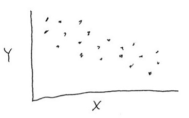
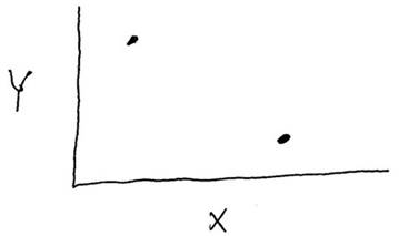
Consider the data shown in the graph below. Is there a correlation and is that correlation statistically significant?
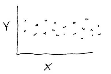
Consider the data shown in the graph below. Is there a correlation between variables "X" and "Y", and is that correlation statistically significant?
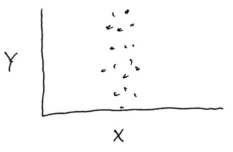
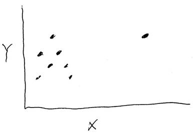
Consider the data shown in the graph below. Is there a correlation between variables "X" and "Y", and is that correlation statistically significant?
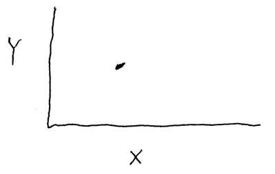
Consider the data shown in the graph below. Is there a correlation between variables "X" and "Y", and is that correlation statistically significant?
Consider the data shown in the graph below. Is there a correlation between variables "X" and "Y", and is that correlation statistically significant?
Consider the data shown in the graph below. Is there a correlation between variables "X" and "Y", and is that correlation statistically significant?
Axes labels and intercepts
Reading graphs is a language skill of its own. Below are just two concepts of graph reading.
In reading a graph (in looking for correlations and interpreting correlations, it is important to be aware of what exactly is being plotted on the graph (read the axes labels!) If you are looking at a graph of seismic wave travel time versus surface distance traveled, that is not the same thing as a graph that plots difference in P and S wave travel times, or a graph that plots travel time versus straight-line distance traveled. Failing to pay attention to exactly what is plotted is a recipe for confusion.
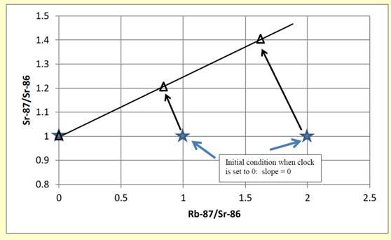
Sometimes the point where a trend line intersects one of the axes provides interesting and important information. When one of the axes goes to zero, what is the physical meaning of the value on the other axis? For example, from another lesson on isochrons used in radiometric dating, we considered how radioactive Rb87 (an isotope of rubidium) decays over time to become Sr 87 (an isotope of Strontium). With time, the slope on an isochron graph changes, as shown below. If we project to the point where Rb87 = 0 (the intercept on the Y axis), we are projecting to a point where Sr87 does not change and therefore we can figure out the starting state of the Rb87 before any time passed.
In the real-world problems below, related to Hg in Minnesota lakes, you need to think about what the projection to the intercept on various graphs means in the physical world.
Identification and interpretation of correlations related to Hg (mercury) in Minnesota lakes
The following graphing and data-interpretation exercise is based on research from Swain et al., 1992, Increasing rates of Atmospheric Mercury deposition in midcontinental North America, Science v257, 784- 787.
To do this lab, you will need to have and use a numerical spreadsheet with graphing and statistical abilities, such as Excel. If you use Excel, you may need to install the add-in analysis toolpak to allow you to do regression analysis and statistics (you will need to find instructions online). There is a data table below that you will need to import into the spreadsheet, you will need to create new data columns using the calculation facility of the spreadsheet, you will need to create graphs, and you will need to perform statistical tests of apparent correlations seen in the graphs. If you don't know how to do these operations, you will need to learn how on your own.
This assignment is intended to exercise your ability to graph and analyze data. A large part of applying geochemical data is the creative ability to conceive of ways to graph or manipulate chemical-composition numbers to help you understand what it really tells you about the problem you are addressing.
This problem is not intended to be a simple calculation, but rather it is intended to be a puzzle where the real goal is to figure out what calculation to do, what graph to draw, or how to interpret either calculations or graphs. The conceptual model for this problem begins with the idea that mercury is addedthrough air and rain deposition both directly to the lake surface (surface area on the table below), and also to the sourrounding drainage basin from which it runs into the lake (catchment area in the table below).
First, let's just get oriented with the general trends of Hg in Minnesota lakes.
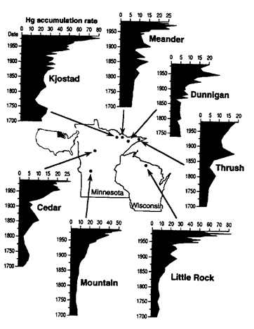
Consider the map and graphs below showing Hg data for lakes in Minnesota and Wisconsin over the past 300 years. Data is based on analysis of lake sediments from different levels in the sediment of the lake (older sediments are deeper and reflect conditions farther back in time).
Once you have interpreted the data as best you can, and written out an explanation/answer, test yourself against the multiple choice question below.
For the following questions, use the data table below. You will need to either do calculations and graphing by hand, or import the data into a spreadsheet where calculations and graphing can be done with the spreadsheet tools. In the table below, flux is in micrograms (of Hg) per square meter per year (μg/m2year1). Surface area and catchment area are in millions of square meters (m2). Surface area is the actual area of the lake. Catchment area is the area of the land outside the lake where water drains downhill into the lake.
|
Lake |
Surface area |
catchment area |
postindustrial flux |
preindustrial flux |
|
Dunnigan |
32.9 |
46 |
16.0 |
4.5 |
|
Little Rock |
18.2 |
35 |
18.6 |
4.6 |
|
Cedar |
39.1 |
88 |
20.1 |
6.0 |
|
Meander |
39.6 |
127 |
22.2 |
6.7 |
|
Thrush |
6.6 |
24 |
26.3 |
8.0 |
|
Mountain |
15.7 |
82 |
31.7 |
6.5 |
|
Kjostad |
167.7 |
985 |
29.2 |
9.1 |
When you have done your best to explain your conclusions, test yourself against the multiple choice questions below.
A geochemist colleague of mine (Randy Korotev) once said that if you can't see a correlation in an x-y graph, then all the statistical tests in the world won't convince people that a correlation is real. This is due in part to the fact that our eye is actually quite good at detecting correlations in a graph and due in part to the fact that most natural data are not perfectly 'mathematically normal'--a prerequisite for the mathematical estimates of statistically uncertainty to be valid--and so the statistical tests need a significant margin of error to be believable--a margin of error that should be visually obvious in a graph.
However, it is still a good idea to test our 'visual impressions' of a statistical correlation with actual statistical tests. To test the correlation between lake size and flux rate, import the data into a spreadsheet that does linear regression (such as Excel), perform a linear regression, and then see what the results are. Note: You may need to install the statistics pack into your spreadsheet in order to run linear regression routines. Please do that first. You will also need to learn how to do and interpret the linear regression analsyis.
We are going to go for 'broad conceptual' understanding of the statistical tests rather than attempt to be mathematically or linguistically rigrous. Here are a few notes on interpreting the results.
For our purposes, the R2 value can be roughly interpreted as the proportion of the total variation in the data that is explained by the correlation. Thus, if R2 = 0.9, then 90% of the variation can be explained by the correlation to the other variable and 10% is due to some other cause, such as analytical imprecision or natural variations in the data due to other factors that are not being modeled by the regression.
The F-statistic is an important statistical test. For our purposes, this can be interpretted roughly as the likelihood that the correlation is due to chance variations in the data. Thus, small F-factor values correspond to a high likelihood that the correlation is 'real'. An F-factor of 1 means that the likelihood that any apparent correlation is due to chance is quite high and a value of 0.01 means that there is a 99% chance that the correlation is 'real'. We might say that the correlation is significant at the 99% confidence interval. Traditionally in science, the statisical lieklihood of something being 'real' must exceed 95% before that result is accepted as 'real' and acceptible for publication. Like your eyeball analysis of the correlation, this factor is based on the observed variation in the data and how much the data deviate from a perfect correlation.
So, if there is no significant correlation between flux rate and either lake area or catchment area, how can we make sense of the different flux rates of the different lakes? It is just 'random chance' with no scientifically-discernible cause?
In fact, there is a very strong correlation present within the data that you have which can help us understand the factors affecting flux rate. Can you find that correlation? One approach to finding it is simply trial and error--is there a correlation between flux and the SUM of the areas? Is there a correlation between the DIFFERENCES in the areas? Is there a correlation to the RATIO of the areas or their PRODUCT? You can also figure this out theoretically. Based on the fact that Hg is falling from the sky with the rain, and Hg that falls directly on the lake will end up in the sediment, but also any Hg that washes off the land will end up in the lake, what correlation might you expect to find?
Use your spreadsheet to calculate the values for each lake corresponding to the SUM, DIFFERENCE, RATIO, and PRODUCT of the catchment size and lake size and find which of them, if any, provides a statistically significant correlation to post-industrial flux rate. You can do this using the linear regression package, although an easier and more visually appealing way might be to simply graph each of these values against the flux rate.
When you have written out your arguments and reasons for why this result is expected and reasonable, test yourself with the multiple choice below.
You might be wondering how Hg acculation rates (flux=mass per unit area per unit time) can be determined since samples were taken at only a single time, not over a period of time. The researchers were actually only able to measure (directly) the concentration of Hg in sediment, not the flux rate. To get the flux rate, the Hg accumulation rate had to be calculated by measuring concentration and then determining how much sediment was deposited during a particular period of time by taking into account how the age of the sediments changes with decreasing depth of sediment. Time in this study was is determined by 210Pb dating (a radiometric dating technique). The problem below illustrates how flux was calculated.
last updated 6/10//2020. Data and one image from Swain et al., 1992, Science v257, 784- 787. Other pictures and text are the property of Russ Colson.
